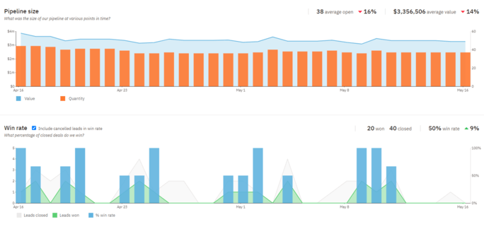
Unlock the Power of Advanced Data Visualization and Reporting With Your CRM
-
Last updated on: February 20, 2026
If the idea of manually going through pages of customer data to find patterns and trends makes you want to recoil in fear, don’t worry. With advanced data visualization and reporting tools via your customer relationship management (CRM) system, you can make data analysis a process to look forward to.
What is data visualization?
Data visualization is a technique in which businesses translate their data into charts, graphs, infographics, and other visual representations to display complex data. The key goal of data visualization is to make complex data easier to understand, interpret, and pull insights from.
Types of data visualization methods
There are many different ways data can be visualized, and each data visualization method works best for different types of data. Below are some common data visualization methods, along with brief explanations as to why they work well for different data sets:
Summarize with AI
- Tables: Tables use rows and columns to organize data into comparable variables. This data visualization method is great for those looking to compare different sets of data.
- Line and area charts: These visuals use lines and stacked variables to show series of data points over time. Line and area charts are great visualization methods for predictive analytics.
- Pie charts and bar graphs: Pie and bar charts are divided into different sections, with each group representing a fragment of a whole. Like tables, pie charts and bar graphs are great visualization tools to use when comparing sets of data.
- Scatter plots: Scatter plots are most commonly used in regression analysis and are helpful for identifying relationships between two variables.
- Histograms: With histograms, businesses can plot a distribution of data points and use it to identify outliers within a given data set.
- Tree maps: Tree maps display hierarchical data via a series of nested shapes, making them great visualization tools for comparing proportions.
- Heat maps: Heat maps visualize geographic data. Whether it’s a location on a map or a website, heat maps help businesses visualize data by location.

Benefits of advanced data visualization and reporting
Advanced data visualization and reporting tools are huge assets by themselves — they make interpreting data to find patterns, trends, and other helpful insights easy for businesses and simplify the data analysis process.
Using advanced data visualization and reporting tools opens up doors for new opportunities to organize data and use your CRM to its full potential. Ahead are some additional key benefits of using advanced data visualization and reporting tools within your CRM.
Create interactive dashboards and customized reports
With the help of your CRM, you can create dashboards that display your most important charts and graphs so key business information is always available and easily accessible. Not to mention, easy to read thanks to your use of advanced data visualization tools.
These key performance indicator (KPI) dashboards can be customized to only show the data you need and reflect the information that’s most important to your company’s sales, marketing, and customer service goals.
Identify new areas of opportunity for sales and marketing
Identifying new opportunities for sales and marketing efforts is a benefit of advanced data visualization and reporting that we can’t talk about enough. Especially for visual learners, data visualization methods like charts and graphs make it easier to spot trends and patterns in data that can indicate new avenues for selling that your business may not have considered before.
For example—through histograms, your team might notice a significant number of outliers within a data set. Investigate why and how those outliers came to be and see if they indicate a new avenue for sales and marketing for your company.
Advanced data visualization and reporting with Nutshell
If you’re looking for an all-in-one CRM system that’s easy to use and makes software integration hassle-free, you’ve come to the right place. At Nutshell, we understand the importance of customer data in business—that’s why we created a CRM that allows users to integrate with existing software and aggregate data in one easy-to-reach place.
We didn’t stop there, though. Nutshell CRM is equipped with advanced data visualization and reporting capabilities to set every user up for success. Nutshell’s reporting and analytics tools help you and your team stay in the loop of what’s working for your business and what needs to improve.
From sales tracking tools to customizable charts and graphs for data displays, you can ensure your customer data is always organized, easy to read, and ready to be presented at any given time.
Reporting & Analytics With Nutshell
Frequently asked questions about data visualization and reporting
-
How do I choose the right data visualization type for my CRM data?
Start by identifying your goal. Use bar charts to compare values between categories (like sales by region), line charts to show trends over time (monthly revenue), and pie charts for parts of a whole (market share by product). Scatter plots reveal relationships between two variables (deal size vs. sales cycle length), while heat maps highlight patterns across categories. The key is matching your chart type to your question: comparison, trend, relationship, or distribution.
-
What’s the difference between Nutshell’s reporting and other CRMs like Salesforce or HubSpot?
Nutshell delivers powerful reporting without the complexity or cost. While Salesforce offers extensive customization, it requires technical expertise and costs 3-5x more. HubSpot’s free CRM has limited reporting features, with advanced analytics locked behind expensive tiers. Nutshell provides customizable dashboards, drag-and-drop report building, and visual analytics at a fraction of the price—starting at $16/user/month. You get enterprise-level insights with small-business simplicity, no consultant required.
-
What are the most common mistakes to avoid when creating CRM dashboards?
Avoid information overload—focus on 5-7 key metrics per dashboard rather than cramming in every data point. Don’t use the wrong chart type for your data (pie charts for trends, line charts for comparisons). Skip decorative elements that distract from insights. Ensure your dashboard passes the “5-second test”—users should grasp the main takeaway in under 5 seconds. Finally, don’t forget white space; crowded dashboards overwhelm users and hide important patterns.
-
How can I use data visualization to identify new sales opportunities?
Look for outliers in your data—unusually high-performing products, regions, or customer segments often signal untapped potential. Use trend lines to spot emerging patterns before competitors do. Compare win rates across industries or deal sizes to find your sweet spot. Heat maps can reveal geographic areas with high engagement but low conversion, indicating where to focus sales efforts. Nutshell’s customizable reports make it easy to segment data and uncover these hidden opportunities.
-
Do I need technical skills to create custom reports in Nutshell?
Not at all. Nutshell’s reporting tools are designed for real salespeople, not data scientists. Our drag-and-drop interface lets you build custom reports in minutes without writing code or formulas. Choose from pre-built templates for common reports (sales forecasts, pipeline analysis, activity tracking), then customize them to match your process. If you get stuck, our support team and extensive knowledge base have your back. Most users create their first custom report within their first week.
Dive into your data today with Nutshell
Don’t wait—dive into your data with Nutshell’s data visualization and reporting tools today! Learn more about what Nutshell’s all-in-one CRM can do for your business by getting in touch with one of our CRM specialists online or starting a free trial today.
BACK TO TOPWritten by
Kevin Randolph Partnerships and Outreach SpecialistReady to try
Nutshell for Free?Thank you! Your submission has been received!Oops! Something went wrong while submitting the form.
Sales Performance Reviews: 9 Tips to Make Them Valuable
Published on: November 10, 2022What Are the Top 3 Go-To-Market Strategies?
Published on: November 10, 2022Highly Effective Strategies for Elevating Sales Team Performance
Published on: November 10, 2022Join 30,000+ other sales and marketing professionals. Subscribe to our Sell to Win newsletter!
- Product
- Nutshell Overview
CRM & Sales
Our powerful and easy-to-use flagship product.Marketing
Email marketing, forms, landing pages, and more.Engagement
Webchat, SMS, WhatsApp & more in your Omni-Channel Inbox.Prospecting
Prospect for new leads and new contacts in your CRM.Quotes & Invoices
Quickly create quotes & invoices in your CRM.
AI
See why Nutshell is the leading AI CRM.Integrations
Connect to Google/Microsoft and over 5,000 Apps.
ReportingCreate reports and forecasts in an instant.CRM Advisor
Get a dedicated point of contact to get the most out of Nutshell.Partner Marketplace
Find trusted partners to help optimize your Nutshell CRM.
- Pricing
Nutshell AI
- Resources
- Contact Us
Contact Sales
Send us your questions or book a 1-on-1 demo.Join a Demo
Join a group demo for a general overview of Nutshell.
Contact Support
Contact our support team via live chat in app or via email.Become a Partner
Refer businesses to Nutshell & earn commissions.
Contact Marketing
Questions about our website or our marketing opportunities?Careers
Join our growing team! See current openings.