What in the world is “style,” anyway?
Style is the set of guidelines that a brand follows in order to provide customers and prospects with a consistent, coherent experience at every touchpoint.
In layman’s terms, it’s everything your brand does to create a specific vibe. You know the vibe when you see it. For Nutshell, that vibe is warmth, friendliness, and a dash of quirkiness.
Maintaining that vibe is not an easy trick to pull off. When multiple departments are following their own rules for communication, the results can be disorienting. The solution is to establish style guidelines that feel natural to our brand, and then be flawlessly consistent about them.
Here’s how you do that.
Chapter 1: Writing
Consistency is the only writing rule that matters.
Having a unified writing style provides our customers and prospects with a consistent, coherent experience at every step of their journey.
This is not an easy trick to pull off. When various departments are following their own internal rules for written content, the results can be disorienting. The solution is to establish a set of writing rules that feel natural to our brand’s voice, and then be flawlessly consistent about them.
This Nutshell writing style guide provides rules and recommendations for how all team members should communicate in written materials, from marketing content and help documents to in-app copy and customer communications.
Every time we write, we’re speaking as Nutshell. That’s a big responsibility. Thanks for taking it seriously.
What is Nutshell’s “voice”?
Nutshell’s personalized support and focus on supporting our customers from the moment they start a trial differentiate us in the software industry. Everything we write should convey that kind of warmth and humanity.
That doesn’t mean we should be cutesy or silly or OVERLY EXCITED!! Sales and marketing teams don’t need their software to be their pal. They’re looking to close more deals—and we’re here to help.
- Nutshell’s brand voice is warm, direct, friendly, sympathetic, and free of jargon. Here are some ways we express that in our choice of words:
- We discuss the benefits of Nutshell more than the features.
- We might ask a person, “Where do you need help?” instead of “What is your business goal?”
- We’d say “Read our guide” instead of “Download the whitepaper.”
- We’d offer “good ideas” instead of “best practices.”
- We serve “people” or “customers,” not “users.”
- We’d “use this” instead of “leverage this” or “utilize this.”
- We’re “working hard,” not “killing it” (or God forbid, “crushing it”).
These ideals should shine through in our writing:
- We write for everyone. Not all readers will have the same level of familiarity with CRM and email marketing software, so our goal is to have conversations with people anywhere on the knowledge spectrum, without talking down to them.
- We build great software and believe in smart design, but we aren’t techy or geeky.
- We value hard work and efficiency over growth hacking or hustling.
- We are passionately committed to quality, integrity, and craftsmanship, and we live it by putting our names on what we build.
Ultimately, the goal is to write the way you speak. If your writing sounds like an actual human being is talking, you’re doing it right.
Follow the guidance below to ensure that your writing is warm, conversational, and trustworthy.
Capitalization
- The first letter in “Nutshell” should always be capitalized, except as part of our web address (nutshell.com) or Twitter handle (@nutshell):
- “Thousands of businesses are already growing smarter with Nutshell.”
- Not: “Thousands of businesses are already growing smarter with nutshell.”
- Nutshell’s product tiers and offerings should be capitalized:
- Nutshell Foundation, Nutshell Growth, Nutshell Pro, Nutshell Business, and Nutshell Enterprise
- Not: Nutshell foundation, Nutshell growth, Nutshell pro, Nutshell business, and Nutshell enterprise
- Companies, People, Leads, Reports and Outreach should be capitalized when specifically referring to those features/tabs of the Nutshell app—but not when referring to those terms in a more general sense.
- “Welcome to Nutshell’s new Reports! All your saved reports are here, but now with better visuals and lots more functionality. You can even download presentation-ready charts and share reports with your team.”
- Not: “Welcome to Nutshell’s new Reports! All your saved Reports are here, but now with better visuals and lots more functionality. You can even download presentation-ready charts and share Reports with your team.”
- Page headings and article headlines and in-button copy use title case.
- “CRM and Email Marketing That Teams Love”
- Not: “CRM and email marketing that teams love”
- Subheadings and in-app button copy should be presented in sentence case—where only the first word and all proper nouns are capitalized—rather than the more formal-looking title:
- “Create new broadcasts”
- Not: “Create New Broadcasts”
- When using a colon, only capitalize the next word if it begins a complete sentence.
- “Sellers and marketers should be working towards the same goal: to drive revenue and grow your business.”
- “Pro tip: If a software company tries to charge you extra for the privilege of technical support, they don’t deserve your business.”
- ALL CAPS should never be used within the body copy of articles, dotcom pages, or emails; we speak, we don’t shout.
- CTA button copy on the dotcom and in email communications may be styled in all caps. (e.g., “LEARN MORE,” “FREE TRIAL”)
Punctuation
- We use single spaces between sentences. Like this. Got it?
- The Oxford/serial comma should be used in a series of three or more terms:
- “Bring your team’s customers, conversations, and sales process into one place.”
- Not: “Bring your team’s customers, conversations and sales process into one place.”
- Exclamation points should be used sparingly. An occasional exclamation point is appropriate if we’re introducing a new product feature that we’re very proud of, announcing an important company milestone, or thanking our customers. More than two uses on a page is usually excessive. Exclamation points shouldn’t be used to make dull copy seem exciting.
- Hyphens and dashes have different uses.
- The hyphen is the smallest and uses only one keystroke (-). Hyphens are used for multipart words like cost-effective and up-to-date. They also show up automatically when a word breaks onto the next line.
- The en dash is longer than a hyphen and is achieved by hitting option + hyphen on a Mac (–). It’s used when showing a range of values like 2019–2022, pages 14–18 or 9am–10am.
- The em dash is the longest of the three and can be achieved by hitting shift + option + hyphen on a Mac (—). Use it to make a break between parts of a sentence. Em dashes are most often used to clarify a point in the middle of a sentence or emphasize the conclusion of a sentence.
- Following the Chicago Manual of Style, we use em dashes with no space before or after:
- “We’ve always prided ourselves on making sales software that’s easy to learn, easy to adopt, and easy to afford—and now we have the awards to prove it.”
- Not: “We’ve always prided ourselves on making sales software that’s easy to learn, easy to adopt, and easy to afford — and now we have the awards to prove it.”
- Not: “We’ve always prided ourselves on making sales software that’s easy to learn, easy to adopt, and easy to afford–and now we have the awards to prove it.”
- Quotation marks should not be placed around relatively common business terms:
- “Leads become qualified after meeting your team’s criteria for budget, authority, timeline, and need.”
- Not: “Leads become ‘qualified’ after meeting your team’s criteria for budget, authority, timeline, and need.”
- Single quotes are used to quote something within a quotation (see the ‘qualified’ example directly above), and to quote a phrase in a headline or article title.
- Periods and commas should sit inside end-quotation marks, following American English style:
- “We consider our clients as part of our team,” says Managing Partner Ben Lorenz. “‘Always do the right thing’ is one of our core values.”
- Not: “We consider our clients as part of our team”, says Managing Partner Ben Lorenz. “‘Always do the right thing’ is one of our core values”.
- Words ending in ‘s’ should follow the Chicago Manual of Style when making them possessive:
- Add an apostrophe-s for singular common words and singular proper nouns: “the business’s strategy,” “Dallas’s best deli”
- Add an apostrophe only for plural common words and plural proper nouns: “their businesses’ goals,” “the Smiths’ new house”
- Apostrophes are not to be used when pluralizing acronyms:
- “Nutshell is dedicated to helping sales reps win more deals, solving the challenge from which most CRMs suffer: motivating sales teams to embrace the product.”
- Not: “Nutshell is dedicated to helping sales reps win more deals, solving the challenge from which most CRM’s suffer: motivating sales teams to embrace the product.”
- “&” should not be used in place of “and” within body copy:
- “Bring your team’s customers, conversations, and sales process into one place.”
- Not: “Bring your team’s customers, conversations & sales process into one place.”
- Do not indent new paragraphs.
- Bullet points should be used with the following guidelines:
- Lines that introduce bulleted lists should end with a colon (see directly above).
- If the bullet lines are complete sentences, they should end with periods. This is true whether the bullet is composed of a single sentence or multiple sentences (like this one).
- If the bullets are short phrases or sentence fragments, they should not end with periods.
- A bulleted list should not contain both complete sentences and sentence fragments; syntax and sentence construction should stay consistent within a list of bullet points.
- All bullets should be presented in sentence case, with the first letter capitalized.
Additional tips on language and phrasing
- “Nutshell” is the name of our company and our product. While we still occasionally use the phrase “Nutshell CRM” in online ads, that phrase shouldn’t be used on our own website to describe ourselves.
-
- “Nutshell was launched at the Future of Web Design conference in November 2010.”
- Not: “Nutshell CRM was launched at the Future of Web Design conference in November 2010.”
- Second-person voice (you, your) can be used in blog posts and other public-facing copy to create a conversational intimacy:
-
- “In order for your sales and marketing teams to operate as a single unit, you need to know which specific marketing efforts are turning into revenue.”
- To further create a conversational tone, use contractions whenever possible:
-
- “From our award-winning CRM software to our next-door-neighbor service, we’re dedicated to helping businesses like yours be more successful.”
- Not: “From our award-winning CRM software to our next-door-neighbor service, we are dedicated to helping businesses like yours be more successful.”
- Long blocks of text tend to stop readers in their tracks. Limit paragraphs to three sentences or less, and avoid long sentences. Ask yourself: How can I convey this thought in as few words as possible?
- The singular “they” should be used to refer to an anonymous or hypothetical singular subject, rather than picking an arbitrary gender or using “him or her” or “he/she”:
-
- “Finding a new customer is just the beginning; it’s important to keep communicating with them throughout the relationship.”
- Not: “Finding a new customer is just the beginning; it’s important to keep communicating with her throughout the relationship.”
- Not: “Finding a new customer is just the beginning; it’s important to keep communicating with him or her throughout the relationship.”
- “Data” should be treated as a singular noun:
-
- “With Nutshell, all your customer data is at your fingertips.”
- Not: “With Nutshell, all your customer data are at your fingertips.”
- We use the double-L spelling of “cancelled”:
-
- “Open leads can be won, lost, or cancelled.”
- Not: “Open leads can be won, lost, or canceled.”
- “CRM” should be treated as a singular noun when referring to customer relationship management software in general:
-
- “When deciding among different CRMs, it’s important to choose a solution that’s designed for your business’s sales model.”
- Not: “When deciding among different CRM, it’s important to choose a solution that’s designed for your business’s sales model.”
- “CRM” can also be used as an adjective, modifying words like “software,” “platform,” “solution,” or “tool”:
-
- “We believe that smart design makes it possible to create a CRM platform that people enjoy.”
- Spelling out “CRM” as “customer relationship management” is appropriate when defining the term on informational pages such as FAQs and awareness-stage content, but only do it once per page:
-
- “Customer relationship management (CRM) helps sales teams better communicate with their prospects, customers, and each other. Picking the right CRM tool is critical.”
- Not: “Customer relationship management (CRM) helps sales teams better communicate with their prospects, customers, and each other. Picking the right customer relationship management tool is critical.”
- Numbers one through nine should be spelled out, and numerals should be used for 10 and above (this applies to ordinal numbers as well):
-
- “Their success has won them the Ann Arbor SPARK FastTrack Business Award two years in a row.”
- Not: “Their success has won them the Ann Arbor SPARK FastTrack Business Award 2 years in a row.”
- “Woodstock’s Pizza took first place in this year’s Southern California Pizza Tournament.”
- Not: “Woodstock’s Pizza took 1st place in this year’s Southern California Pizza Tournament.”
- Once their client list ballooned to over 50 gyms and fitness centers, they knew they needed a better solution for managing sales relationships.”
- Not: “Once their client list ballooned to over fifty gyms and fitness centers, they knew they needed a better solution for managing sales relationships.”
Exceptions to this rule:
-
- Numbers above nine should be spelled out when they begin a sentence: “Twelve years ago, Nutshell’s founders began sketching out an idea that would change the CRM industry forever.”
- Not: It’s acceptable to use numerals in blog headlines: “Five things your business can’t do with a spreadsheet” or “5 things your business can’t do with a spreadsheet”
- Percentages: “7%” not “seven percent”
- Dollar figures: “$2 million” not “two million dollars”
- Number ranges: “Please include links to 3–4 published articles in your cover letter.”
- Times of day (see below)
- Times of day should be presented in numerals, immediately followed by “am/pm” without periods or a separating space: “2pm” not “2PM” and not “2 p.m.”
-
- Include time zone abbreviations without “daylight” and “standard” time indications: “ET” not “EDT,” “CT” not “CST”
- “noon” can be used in place of “12pm”: “The webinar will begin at 3pm ET / noon PT.”
- “i.e.” means “that is,” and is used to clarify the meaning of a potentially unfamiliar concept. “e.g.” means “for example,” and is used to provide examples for the previous statement.
-
- “Nutshell shows you the status of every lead as it moves through your pipeline (i.e., a set of stages that a prospect moves through as they progress from a new lead to a customer).”
- “Nutshell can help measure the efficiency of your company’s various lead sources (e.g., online ads, content marketing, and customer referrals).”
Four bonus tips for writing emails
Whether you’re sending a mass email to a marketing list or a personal note to a customer, many of the same writing and formatting principles apply.
- Always include a brief subject line of about 6–10 words.
- The subject line should convey the value of the email, in a way that’s compelling but honest. Using “clickbait”-style trickery to lure someone into opening an email they might not actually want to read is always a bad move, as it damages trust in our brand.
- For marketing emails, preview text should also be included to provide more details that might convince the recipient to open the email. Feel free to get a little more tease-y here.

- Stick to “Hi [first name],” for the greeting. (Think business casual.) Not “Hey!” (too casual) or “Dear Mr. [last name],” (too formal).
- Remember that the purpose of an email is to compel an action. As such, the copy length should be as short as possible.
-
- Summarize your main point in the first paragraph, which should be 1–2 sentences long.
- Get to the call-to-action quickly. If the reader has to scroll down multiple times to find what you need them to find, the email likely won’t have the desired result. Instead of including long explanations, link to articles and videos that can educate the reader in more detail.
Chapter 2: Visual branding
This part of the document contains the rules for our visual communication system. Follow these rules strictly to maintain brand consistency. This includes all of the elements you may need—logos, typefaces, colors, and more—to create a consistent tone, look, and feel for Nutshell’s materials. We invite you to absorb this information and reference it often to become an informed keeper of the brand.
Logo
Components
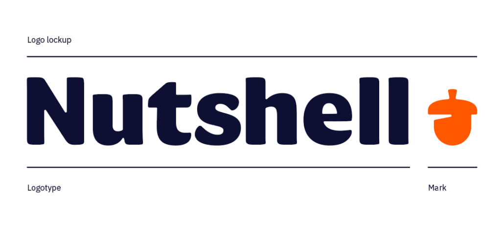
Our logo consists of the Nutshell “logotype” and the “mark.” Together they form the “logo lockup.” These distinctions are small, but they are helpful in applications, discussions and language around visual identity elements.
You can find and download all of these components in different file formats here.

Separating elements
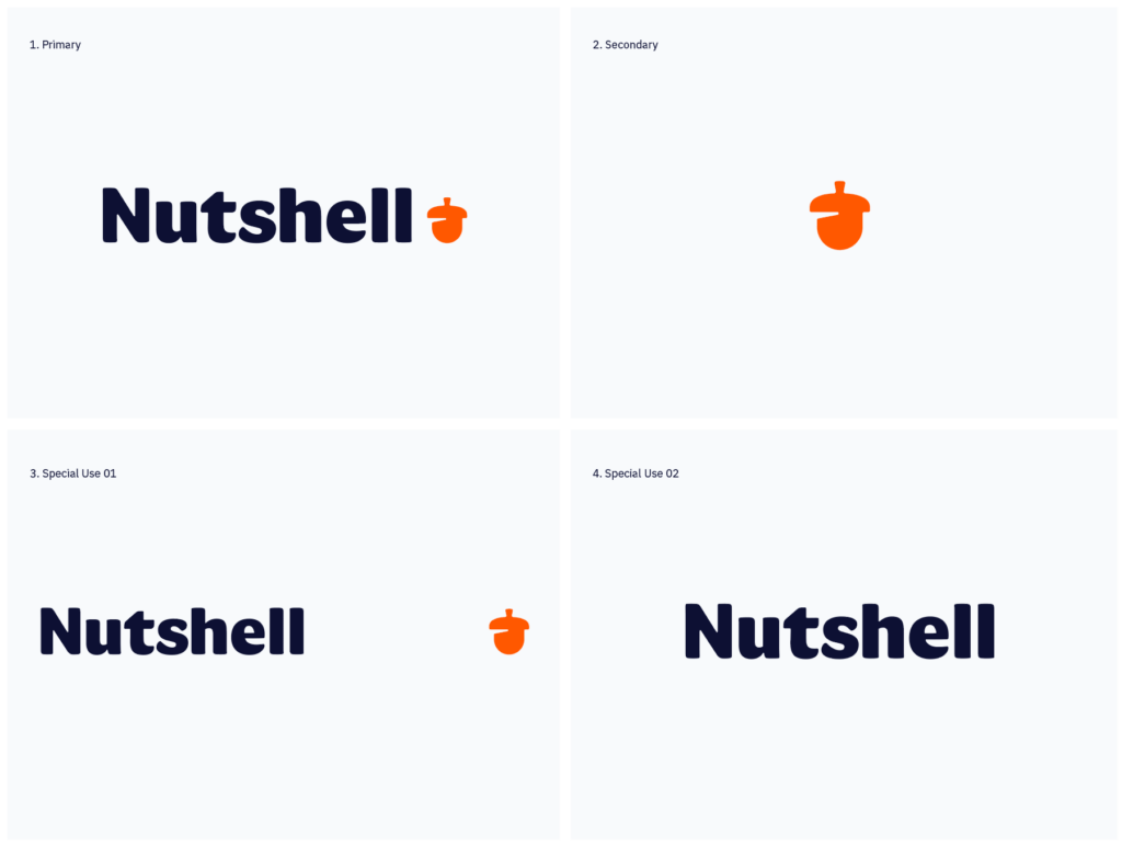
There are four ways the logo can be used.
- Primary. This is our preferred logo in almost all usual circumstances. It should be used in about 90% of our communications. As a company we are still young. We’re still introducing ourselves. This logo has our name set beside our mark.
- Secondary. There are three circumstances where the mark can be used by itself:
- When the full logotype will not fit, such as the app icon or social media avatar.
- As a sign-off, such as in the bottom of a webpage.
- Communications or environments where our brand has already been established.
- Special Use 01. Occasionally it is okay to separate the mark from the logotype. Think of a baseball hat with the logotype on the front and the mark on the back.
- Special Use 02. Reserved for very rare occasions such as merchandise or an illustration. Use your best judgment as to when it makes sense.

Logo Color
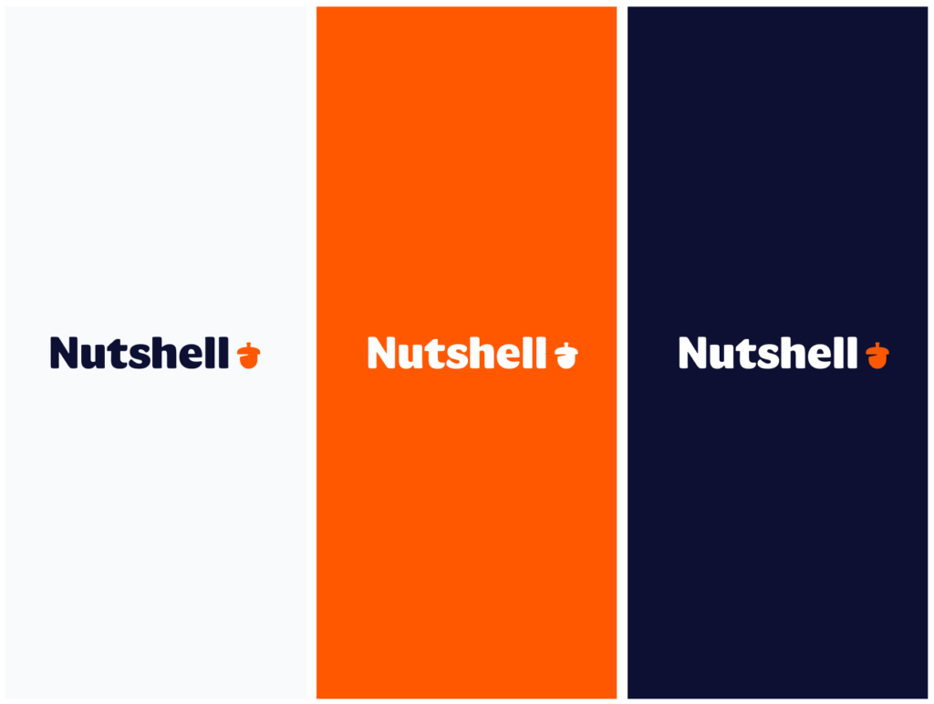
The Nutshell logo is only ever used in three instances. Each instance retains the mark in orange unless going full white for contrast.

Color palette
Primary palette
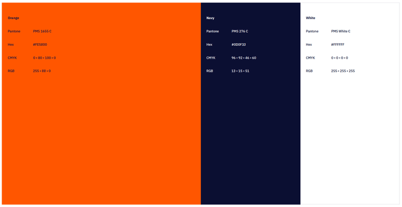
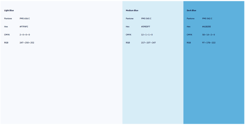
The primary colors of Nutshell are orange and navy. A range of blues supplement and support within the primary palette.
Think of orange as a highlight—highlights are more effective when they are used less often. Use the orange sparingly and with purpose, never for long-form text and rarely for overwhelming floods of color. White also serves as a large foundation, orange brings life, and navy is used for text.
Avoid deviating from these primary colors or creating arbitrary tints and shades of these core hues.

- Orange
#FE5800
R 255 • G 88 • B 0
C 0 • M 80 • Y 100 • K 0
Pantone PMS 1655 C
- Navy
#0D0F33
R 13 • G 15 • B 51
C 96 • M 92 • Y 46 • K 60
Pantone PMS 276 C
- White
#FFFFFF
R 255 • G 255 • B 255
C 0 • M 0 • Y 0 • K 0
Pantone PMS White C

- Light Blue
#F7FAFC
R 247 • G 250 • B 252
C 2 • M 0 • Y 0 • K 0
Pantone PMS 656 C
- Medium Blue
#D9EDF7
R 217 • G 237 • B 247
C 13 • M 1 • Y 1 • K 0
Pantone PMS 545 C
- Dark Blue
#61B2DE
R 97 • G 178 • B 222
C 58 • M 14 • Y 2 • K 0
Pantone PMS 542 C
Secondary palette
The secondary color palette is for lower-tier visual language in marketing (illustrations, flair, and occasional floods of color) and a more primary use case in the Nutshell product.
The secondary color palette includes a spectrum of navy, purple, blue, green, yellow, orange, and red. Each secondary color is provided in tints and shades to maximize control and decrease confusion when contrasting colors. Unless you are a designer, avoid using tints.
- Purple
#524FB8
- Green
#33C252
- Yellow
#FAC942
- Pink
#FF2E47
Typography
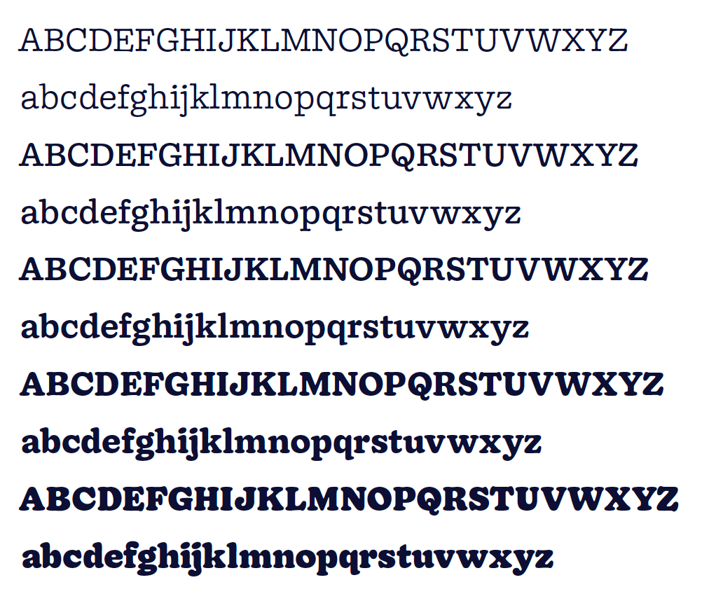
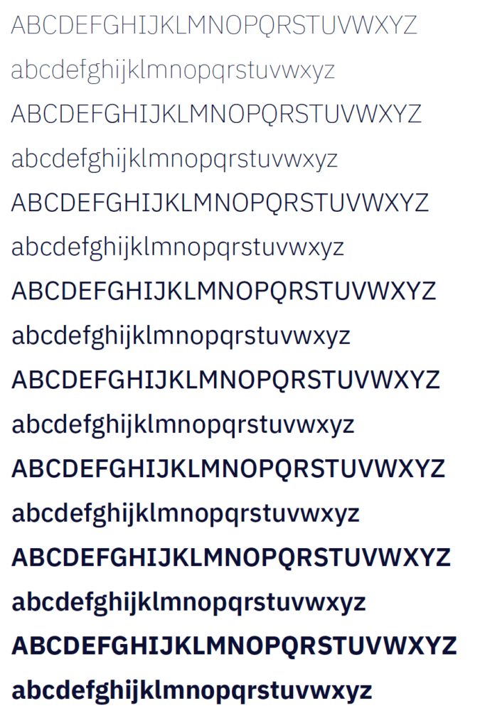
The Nutshell brand uses two typefaces in different weights and styles: Doyle and IBM Plex Sans.
Doyle is a licensed font designed by Sharp Type. Nutshell has purchased a limited number of licenses that prevents us from distributing the font company-wide.

IBM Plex Sans was designed by Dutch type foundry Bold Monday under the SIL Open Font License (OFL) and can be accessed via ibm.com/plex, from GitHub or Google fonts. Do not use IBM Plex Sans Consensed, Mono, or Serif.
If you download and install IBM Plex Sans from Google fonts, you will be able to use it in all of your applications (Adobe products, Google Workspace, Screenflow, etc.)

Video
- Between the growth and support teams, Nutshell has built a substantial library of videos. As our public videos become more widely available and shareable, it’s important that we maintain brand consistency so that viewers know they can rely on the information we’re providing.
- When possible, use the Sony Alpha 6100 camera and teleprompter setup. Andy Jensen can show you where they’re stored in the office. Reference the DIY Webinar Tech setup for instructions.
- Make sure your background looks professional and your audio is close to perfect. The camera should be at eye level.
- Use the logo animation for both the intro and outro. You can find .mov and .gif files here.
- Use only purchased and licensed music from the shared Drive. If we don’t have what you’re looking for, find it and run it by your manager first. We can add to our library.
- Use IBM Plex Sans for any title screens or text within the video.
- We prefer to upload a custom video thumbnail in YouTube to maintain a well-branded channel. Reach out to Rebekka for custom thumbnails.
- When customizing the Player color in Wistia, avoid orange and choose from our brand colors Navy (#0C0F33), Dark blue (#61B2DE), Green (#33C252), Yellow (#FAC942), or Purple (#524FB8).
- Add chapters when possible for easy skimming.
- Add Transcripts and Close Captions for Accessibility. Be sure to proofread the transcripts.
- YouTube adds these automatically.
- You can generate Transcripts in Wistia from the overview tab.
Odds ‘n’ ends
- When possible, remove underlines from hyperlinks.
- Use our primary orange color #FE5800 for hyperlinks.
- To improve website accessibility ensure all link text can be understood out of context (don’t use “click here” language).

