The upcoming launch of Nutshell’s first-ever email marketing tool will take our product from best-in-class CRM to a new competitor in an emerging category: growth software. That evolution calls for a reimagining of certain visual assets, and the retirement of others.
With that in mind, Nutshell has been working behind the scenes to create a brand-new logo and wordmark, as well as a number of visual improvements within our app. Drum roll please…
BEN GOLDSTEIN: What inspired us to invest our time and resources in visual rebranding at this moment?
ANDY FOWLER: The two inputs to this were 1) when we would have the internal resources to take on this project, with all of the members of the team necessary to do it, and 2) when it was relevant externally and in the company’s timeline.
The stars began to align toward the beginning of this year. We felt like we had all the right voices in the room for a rebrand like this and a common understanding of where we’re going as a company. And then externally, we’ve been planning and hinting at an ambitious new product direction that we’re building out this year, and it made sense for a fresh look of Nutshell to coincide with an ambitious step forward in the product.
Before we get into the effort that went into our visual rebranding, what was “wrong” with our previous current wordmark and logo, if anything? Was it outdated from a design perspective, or was it just time for a change?
REBEKKA KUHN: There was nothing specifically wrong with it. We had certainly built up plenty of brand recognition with our previous logo, so we didn’t want to change things too dramatically. But having personally worked with our logo over a number of years, I would often see it lined up with our competitors, and I wanted it to be bigger and bolder. Our product stands out among our competitors, and our logo needed to stand out as well.
I also think there was a legibility issue for people who aren’t familiar with our brand, with the acorn being the “e.” When our customers see that logo, they know right away what they’re looking at, but if you’re just being introduced to Nutshell, it’s important to make sure the wordmark is as legible as possible.
We didn’t want to lose the acorn altogether because it’s a strong identifier with Nutshell, but we wanted to reimagine it a little bit. Also, our orange color wasn’t something we were ready to lose entirely. We just needed to redefine where and how it’s used.
Our product stands out among our competitors, and our logo needed to stand out as well.
— Nutshell Brand Design Lead, Rebekka Kuhn
ANDY FOWLER: In the 10 years of using Nutshell’s previous logo, we’ve had fresh coats of paint on our public-facing website and inside our product. We’ve reinterpreted the brand in each of those places and they’ve started to diverge over time. Having this all-hands revisiting of the brand where we brought the product and the marketing face of the company back into one cohesive look and feel was really important to this project.
How did we go about finding a brand agency for this project? What were you looking for, specifically?
REBEKKA KUHN: First we had to evaluate what we could do in-house, what was the best use of our time, and where we wanted to bring on some new resources. We determined that it was specifically the development of the logo and the color palette that we could really use an outside opinion for.
There are tons of branding agencies out there who could do a great job, but a project like this comes down to a relationship and an understanding of our brand. Focus Lab has had a previous relationship with one of our co-founders and did some work for Cahoots before, so they were definitely on our radar.
ANDY FOWLER: In addition to the existing relationship that we already had through some neighboring companies in Ann Arbor, the work that Focus Lab had promoted on their Dribbble account and through their portfolio gave us a lot of confidence in their ability.
Something that really shines through in their portfolio is that while they have worked with plenty of SaaS and business software companies, they don’t all revert to the mean, where it feels like they’re doing the same brand over and over again. Even though they’re worked with a lot of companies that look like us, it felt like their portfolio reflected an understanding of each company’s individuality.
REBEKKA KUHN: We had a really good initial conversation with them and it just felt like a right fit. They understood very specifically what we were looking for and weren’t trying to nudge us in any particular direction that we weren’t quite ready to take. And they have such a talented team that we felt like we were in good hands for the entire process.
We had a very well-established brand and we were coming to them with a very specific set of deliverables, so it’s not like they were building a brand from the ground up. They had a lot to work with already and I think that was a unique challenge that they were ready to embrace.
[Bringing] the product and the marketing face of the company back into one cohesive look and feel was really important to this project.
— Nutshell Co-Founder, Andy Fowler
What was the initial direction you gave Focus Lab? Were there any parameters they had to work within?
REBEKKA KUHN: There were only three things that we wanted them to do: updating our logo, reevaluating our typography, and reevaluating our color palette for use in both our marketing and product so that we could unite them.
We weren’t looking for a lot of other stuff because we already have a pretty strong brand voice and brand messaging, and a team of people who do that really well, so we didn’t need to spend a whole lot of time redefining and reevaluating our voice.
ANDY FOWLER: Rebekka led the effort in getting us all on the same page. Like she said, we’ve got 10 years’ worth of history and context and voice already established, but to package all of that up and hand it over to a designer who’s known us for a couple of days is a challenge. So Rebekka organized a really effective brand voice seminar where we did an exercise that would usually be done in person, in front of whiteboards, and adopted it for a COVID-19 world.
That workshop was really effective in bringing in different voices inside the company, and level-setting on what we were talking about and what our voice and identity is. We packaged up the results of the discussion and handed it to Focus, and that very quickly brought them up to speed.
Learn more about the brand workshop structure that Nutshell used to kick off this project.
What did Focus Lab’s first round of deliverables look like, and how many rounds of back and forth did it take to get to the end product?
REBEKKA KUHN: Focus Lab listened to us so closely that they were able to nail a pretty good direction within one or two rounds. And then it was just a lot of listening to our feedback and working with our own product team to make sure that their deliverables worked for us in a “boots on the ground” sort of way—getting the colors to work, making sure the typography worked. We were on a six-week timeline, and the refinement process is what took up most of the time. Their idea worked off the bat, it was just a matter of making it shine.
ANDY FOWLER: Something that Rebekka really helped to shepherd in the project was knowing when to listen to the professionals and when to ask them to take another shot at things. One example was the typography where they had this kind of wild first draft of a font. It really leapt off the page and it felt like Nutshell except for like one or two things, but those things were deal-breakers. Like, the italic version was super goofy.

REBEKKA KUHN: Those were some aggressive italics.
ANDY FOWLER: They were really aggressive italics! And as they were working to refine and find alternatives, I was tempted to say, “Let’s go back, we can work with the crazy italics.” And Rebekka made the great call to make sure we found something that would be durable for the long run—a choice that would really work for us.
It was important to know when to leave it to the professionals and let them apply a practiced hand. I think that’s a challenging thing to know when to push on something and when to accept what someone is saying.
Whose idea was it to get rid of the acorn dots? I’m sure that had to be a bittersweet moment.
REBEKKA KUHN: I think it was my idea not to keep them. It was not a priority to keep them.
ANDY FOWLER: The dots went from nine back in 2010 to five in 2014. So they were on a clear downward trajectory to zero.
REBEKKA KUHN: One of the problems with the dots is that they never reduced well and when the Nutshell logo got really small, you didn’t even really see the dots; they were just this fuzzy blur. And there were certain formats and applications—neon signs for instance—where those dots were nearly impossible to reproduce. So the dots were something that was not essential to keep in the acorn.
What were you most nervous about as the project neared completion?
ANDY FOWLER: Unlike a lot of projects where that last mile gets really scary, I actually felt like this was the rare creative project where the closer we got to the end, the easier it got. We really hit our stride toward the end.
There was definitely some tension in the beginning between respecting the visual legacy of this brand that has 10 years of industry and customer recognition and means a lot to me personally and to our team, but also not coming up with just a milquetoast facelift or a slight tidying up.
I felt like I was putting undue pressure on their designer by saying, “Respect 10 years of legacy, but don’t make it look totally different, but also don’t make it look bland or middle-of-the-road.” The fact that I couldn’t communicate where on the spectrum of old and new we were looking to land on, or even picture it in my head, was intimidating.
But after we got the first draft from Matt Yow at Focus, I started to feel a whole lot better about the rest of the project. We still had plenty of back and forth, but just seeing that very first draft was the biggest anxiety release of the whole project.
REBEKKA KUHN: I knew that it was going to turn out great from that very first pass that they took and presented to us. My biggest source of anxiety was in presenting the finished product to the team and getting their buy-in. I personally felt strongly about it, but you still want to make sure that everyone feels good about it and can get behind the brand that they’re supporting and selling and building every day.
Updating the Nutshell logo everywhere it appears on the internet seems like a Herculean effort. What’s our game plan for rolling out the new visual assets?
REBEKKA KUHN: Actually, replacing the logo in all those places isn’t as much work as the daily exercises of making sure that all the little things that we put out—whether it’s blog posts or ads or sponsored newsletters or elements in the product—remain consistent over time.
Replacing a logo is pretty easy, and it’s easy for us to switch out color palettes here and there. It’s making all those other brand extensions consistent and accurate and true to the voice of Nutshell that will really require the entire team’s efforts over time, and will make our brand really, really strong.
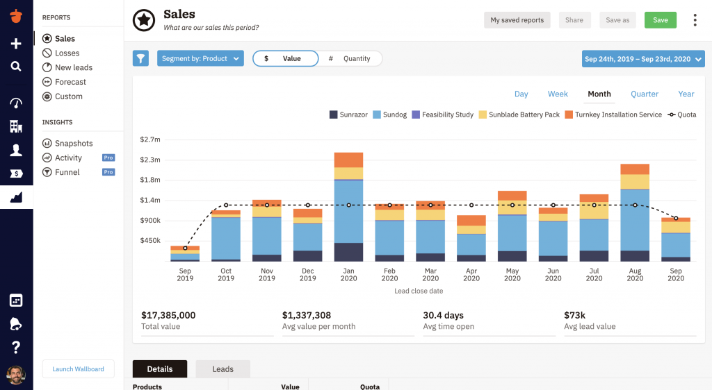
Outside of the new logo, there are a bunch of visual changes that users will be seeing within the Nutshell app. Andy, I was wondering if you could talk us through that a little bit.
ANDY FOWLER: A lot of times when a SaaS company executes a rebrand like this, you’ll see a new logo, maybe a new color palette, a fancy new homepage, some new videos, a lot of big marketing splash. And if you’re lucky, maybe the product has changed its color a little bit, or the login page has changed. Nutshell has gone through that, too, where we’ve launched significant new homepages and new updates to our marketing presence while not doing the same thing in the product, where the intention is to take those things one step at a time.
Something that we didn’t take on with this project was a splashy new homepage. Rather than coming up with a really cool-looking website and waiting for that to trickle down into the product, we’ll be rolling out the new color, look, and feel inside of the app at the same time, so we can bring the product and the website closer in line with each other.


Inside of the product, you’ll probably see more changes with regard to typography and color. We had recognized the divergence of experience in the product and elsewhere, so one of our goals for success of this project was seeing the brand reflected in the product more uniformly. And the fun thing about doing that is that it helped us wind up with a brand that was kind of a workhorse in a web application. The typeface that we’re using, IBM Plex Sans, can do a lot of heavy lifting. It has a lot of different weights that will support a complex web application.
On a personal level, how do you both feel about the end product?
ANDY FOWLER: I’m really enthusiastic that this visual brand isn’t just a coat of paint on the company, but that it’s infused into everything that we’re doing. Our customers are spending hours a day inside of Nutshell, and they’re using something that’s easy on the eyes, that’s legible and accessible, and it’s just a much better experience that way.
Despite all the anxiety I felt at the beginning around respecting the legacy of the brand and wanting to see it advance and modernize, I think we nailed it, and I can’t imagine us having ended up in a better place.
REBEKKA KUHN: I’m definitely pleased with the way it all turned out. I think the logo bridges the gap between old and new without being too trendy. We fit in with our competitors and other software that our users use, but we still stand out. And I think that this logo can stand the test of time.
I’m also really excited about the product changes that we’ll see over time. The logo, the typography, and the new color palette will help influence and inspire our product designers to take certain components of the product to the next level. I love that there’s all of that possibility and potential in the future, and that it’s not just this thing that’s going to happen once, but will help us to keep building bigger and better in the future as well.
No problem. To see if Nutshell is the right choice for your sales team, start a 14-day free trial today!


Join 30,000+ other sales and marketing professionals. Subscribe to our Sell to Win newsletter!