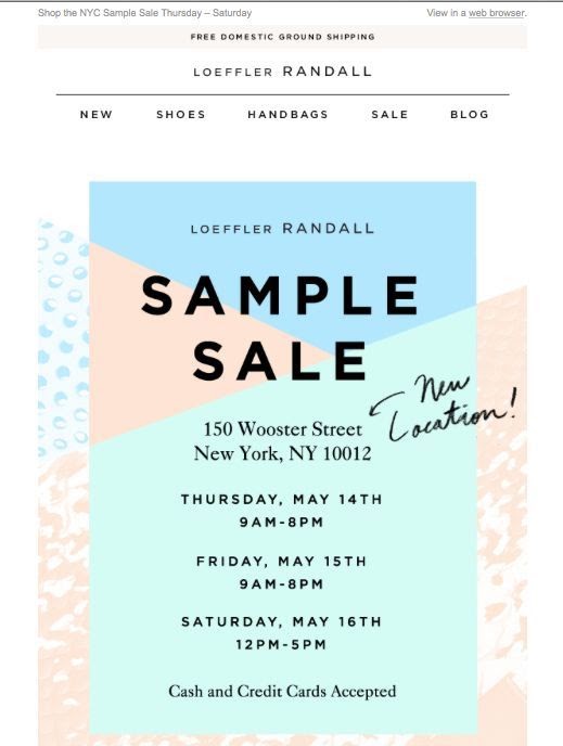
Email Newsletter Layout & Design: 8 Best Practices to Boost Clicks


You might also like
Gravity Forms CRM Integration: How to Connect & Optimize Lead Capture
Published on: October 29, 2025
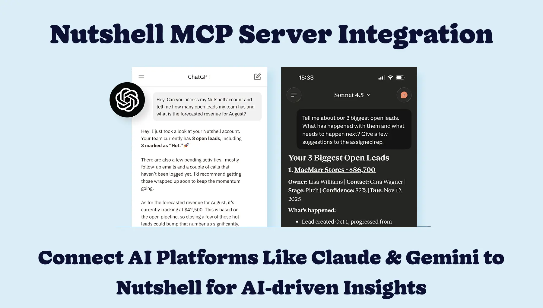
Connect AI Platforms Like ChatGPT & Claude to Nutshell in Minutes for AI-driven Insights
Published on: December 1, 2025Join 30,000+ other sales and marketing professionals. Subscribe to our Sell to Win newsletter!
Supporting over 5k companies across 50 countries since 2009