Use visual cues like arrows, faces, and emphasized text to guide visitor attention and prompt quicker decisions, streamlining the user experience.
Match the style of your visual cues to your brand personality and always A/B test different cues to determine what resonates best with your specific audience.
Utilize heatmaps to understand user behavior and ensure your visual cues are effectively guiding users as intended, while remaining aware of potential biases.
Visual cues in digital marketing influence users to click stuff and make decisions. If your content isn’t visually optimized, you’re losing money.
Whether you sell software or razors, you’re in the business of solving people’s problems. Your digital marketing efforts are no different. A brand’s website or ads should be optimized in such a way that they help potential customers find solutions to their problems—quickly. Visual cues make that possible.
This guide explores what visual cues are, the power simple imagery can often have in reinforcing your branding message, and which visual cues you should use to optimize the impact of your marketing materials, along with examples of visual cues in action. As this article details, there is a strategy for choosing and implementing specific cues for each brand and the call to action you want the consumer to respond to.
Visual cues are design elements on webpages, ads, and other digital marketing channels that help people make sense of information quickly. These tiny details come prepackaged with expectations, working as a sort of mental shortcut for users.
Visual cues are vital for providing a seamless user experience (UX). UX design is the process of creating a product, such as a web page, that is easy for users to navigate and helps them solve their problems faster. Visual cues assist UX design in achieving those aims.
Visual prompts are especially important online, where users are constantly being barraged with ads, graphics, and text all vying for their attention. The cues reduce the clutter on a page or ad while also communicating important info.
Visual prompting comes in several forms, from obvious symbols (like arrows) to the specific selection of colors that dominate your brand. Since your company’s homepage is often someone’s first exposure to your brand, visual cues like these can ensure that visitors flow through the site and come away with a strong understanding of what you or your product has to offer.
Arrows
Perhaps the most straightforward visual prompt is the humble arrow. An arrow is an obvious, yet unobtrusive way of showing readers exactly where their focus should be.
An arrow is so effective at directing readers’ attention, one experiment from CXL found that it outperformed three other types of visual cues in driving conversions.
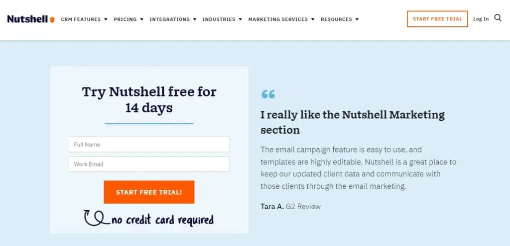
Nutshell uses a cool loopy arrow to highlight the free trial button at the top of its homepage.
The arrow adds a little extra attention and a clear call-to-action, so there’s no question about where visitors should click.
Arrows can also indicate where you can find extra info without cluttering the page with more text boxes.
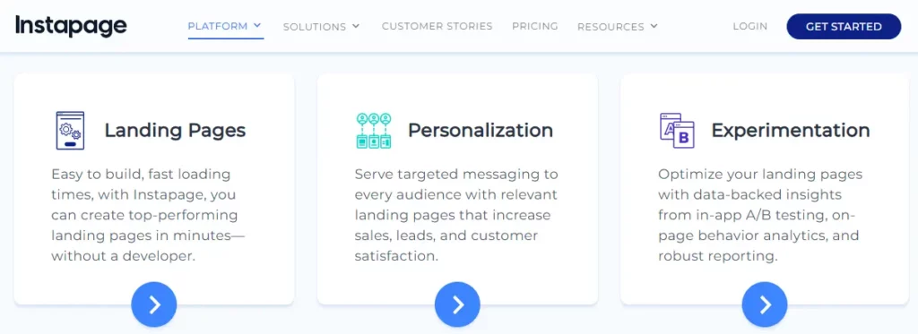
Instapage, a landing page platform, directs readers to learn more about the software’s many features with the help of subtle arrows.
The arrow shows visitors that content continues below the fold, reducing the likelihood that they’ll close the page entirely.
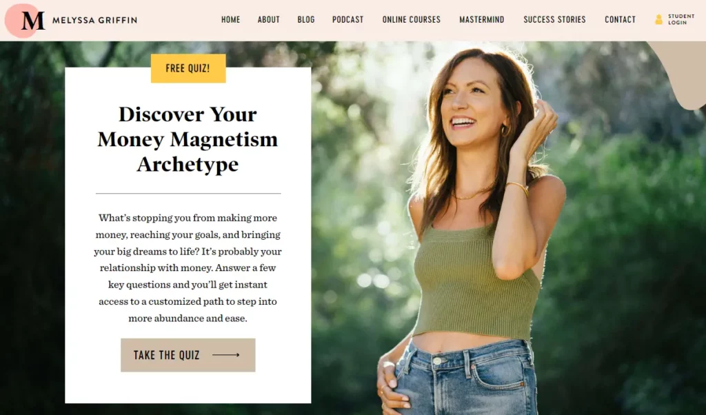
Pictures of people
Humans are naturally drawn toward other people’s faces, making portraits a natural visual cue. Portraits can attract a reader’s focus and, depending on the emotion displayed by the portrait subject, prompt the reader to feel a certain way.
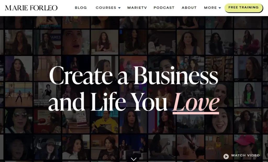
A photo of a subject gazing toward text on the page can help direct a reader’s attention. The portrait subject’s gaze also reinforces the text’s importance.
Melyssa Griffin, an online business coach, uses this visual prompt to encourage visitors to take a quiz, which then gets them on her email list for them to see their results.
While pictures of people can be effective for a personality-driven brand, think twice before using them as visual cues for a product. When a picture of a person does nothing to communicate info about the product, conversion rates fall.
DOWNLOAD
Want to generate more leads? (Of course you do.)
The B2B Marketer’s Toolkit collects 120+ of the best lead generation tips ever published on the Nutshell blog. Download it today!
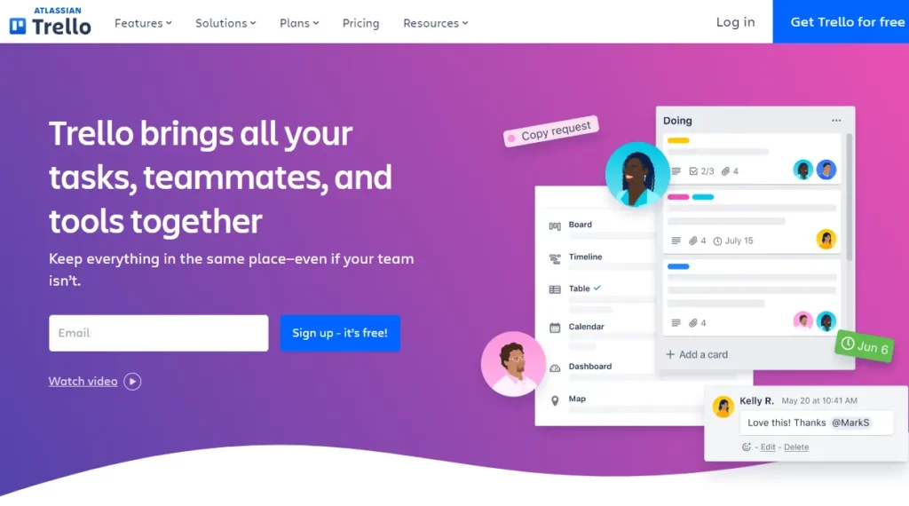
Nothing is more off-putting to a site visitor than a wall of text. Succinct, bold headers are easier to focus on and leave plenty of space for the call-to-action button to shine, which is ultimately what you want potential customers to click on.
Trello, a popular project management tool, keeps its homepage design as clean as possible. Most of the text is reserved for a header and subheader that quickly states Trello’s unique selling proposition.
There also aren’t any menu links to distract visitors, so there are fewer opportunities for them to navigate away. In fact, the only navigation option that is immediately available is an invitation to sign up. Without any excess clutter, visitors easily focus on the sign-up button in blue above the fold, another blue button in the top right corner, and a small link to a video if you want more information.
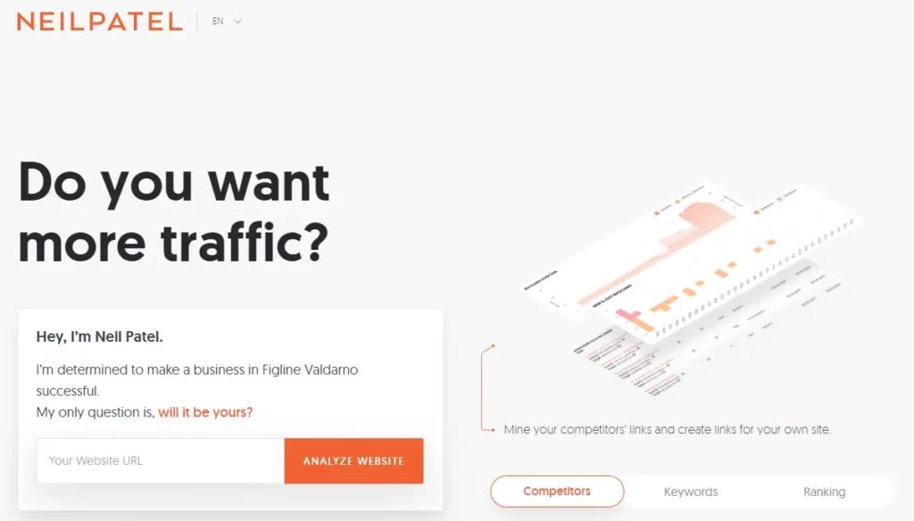
Neil Patel, a marketing expert, takes a similar approach on his website.
The headline is prominent and doesn’t have to compete with menu links or pictures for a visitor’s attention. There’s plenty of breathing room for the bright orange button, which helps grab potential leads for Patel’s business.
Color
There’s an entire field of study devoted to researching the effect colors have on our perceptions, emotions, and even physical senses, such as taste. Known as color psychology, designers and marketers often rely on it when making decisions about a brand’s color scheme.
Consider these common color associations before choosing a color scheme for your brand:
Red – Power, excitement, speed
Pink – Sophistication, sincerity
Purple – Luxury, ambition
Yellow – Happiness, inexpensive
Orange – Excitement, creativity
Blue – Trust, high quality
Green – Fresh, eco-friendly
Brown – Ruggedness
Black – Sophistication, expensive
White – Cleanliness, purity
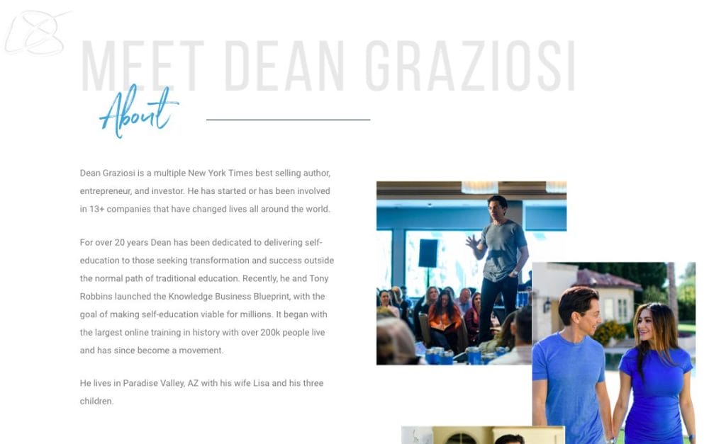
Entrepreneur and public speaker, Dean Graziosi, carries a blue color scheme not only throughout his website, but also throughout his entire brand. Note the blue swag cups in the first picture and the blue clothes in the second:
In color psychology, blue is considered a calming color that conveys dependability and strength. It’s also thought to help people be more productive, which aligns with Graziosi’s business of turning people into entrepreneurs.
Product imagery
Don’t underestimate the power of a product picture. One test from MarketingExperiments found that when the primary homepage picture was changed from a person to a picture of the product, conversion rates increased by almost 72%.
Leadpages, a software that helps you build mobile and desktop landing pages, places a picture of the product in action above the fold on the homepage. This immediately tells visitors what the product does and encourages them to click the “Start a Free Trial” button if they want to achieve similar results.
A few subtle shapes further emphasize the pictures, like the rectangles and circles drawing the eye to the software’s design capabilities.
Opting to show off what Leadpages can do is especially effective when you consider that many of the brand’s competitors have stuck with the quirky illustration design trend that has homogenized much of the branding in the SaaS industry.
Prominent boxes
Forms are common tools for gathering info about potential customers. A prominent box around the form both draws attention to it and helps the form look tidy and encapsulated on the page.
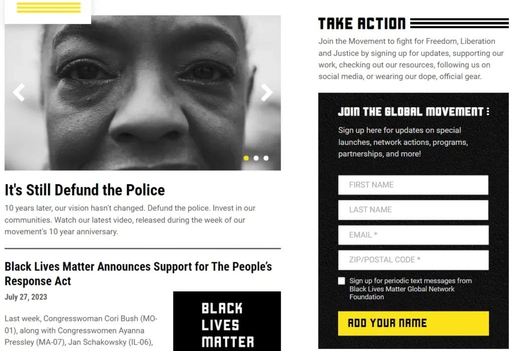
Black Lives Matter’s homepage is bursting with content, as there are a lot of updates they want to share about the movement. To get their email sign-up form to stand out, they encapsulated it in a black box and accented it with a bright yellow button.
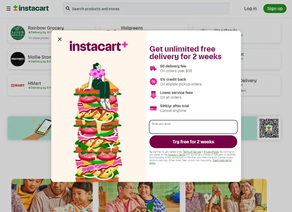
Of course, boxes aren’t just for long forms. They work well for single fields, too.
Instacart, a grocery delivery service, offers a single field for users to input their email to try the service. To contrast the field from the background, it’s enclosed in a plain box with contrasting colors and beautiful animations.
Without a box encapsulating them, fields and forms would just as soon fade into the background. There would be nothing drawing visitors to them and a greater likelihood that they’ll never convert.
How to create a visual cue strategy for your site
It’s tempting to reach for the visual prompts you think look best or have the most data behind them, but the truth is, different visual cues will work better for different brands. Settling on a design strategy for your digital marketing channels requires careful assessment and controlled testing.
Assess your brand
Think critically about how you want to promote your brand to potential customers. Are you a software provider that promises ease of use and a pleasing interface? A whimsical, hand-drawn arrow might be the right visual cue for your brand.
However, if your software is a people-centric HR solution, it might make more sense to design the page with portraits of people gazing toward a call-to-action.
Consider if displaying a picture of the product will give visitors more info or if it’s just a distraction. Prominently displaying a screenshot of a customer relationship management (CRM) tool like Nutshell, for example, might be confusing to new visitors.
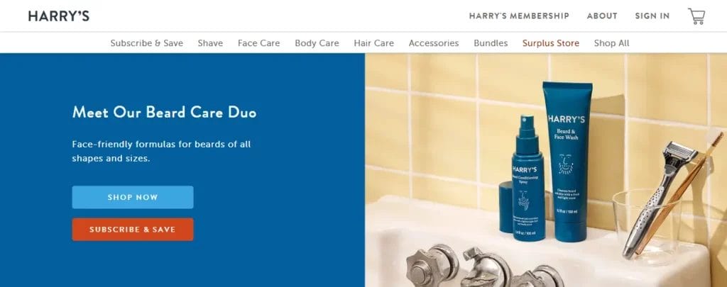
On the other hand, if you’re in the business of selling shaving supplies like Harry’s, a clear shot of the product line communicates a lot with very little.
If you’re unsure exactly what you want to communicate, the brand is still in the early stages of formation, or if you’re interested in doing a rebrand, check out this free association exercise from DeSantis Breindel, a brand development firm. It can give you a better idea of how people perceive your brand versus how you’d like to be perceived. From there, you can make better-informed design choices, such as your brand’s color scheme.
A/B test
A/B testing, or testing multiple versions of the same email, page, or ad, is essential for determining which visual prompts are working best for your brand.
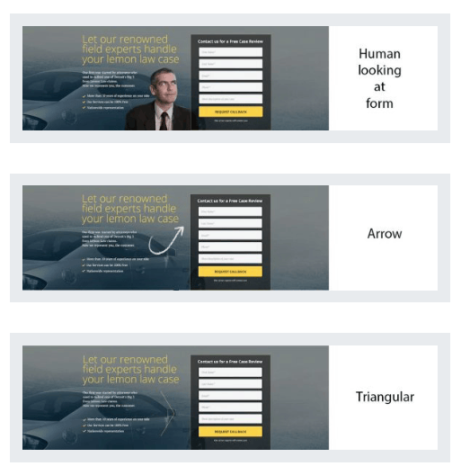
To run an A/B test, simply create two or more versions of the page or ad with only one visual cue that varies on each version. Here’s an example of different versions CXL made when testing their form:
CXL tested these form variations with eye-tracking technology, but there’s no need to shell out that kind of money to test your designs.
If you’re testing your homepage, simply display each version of the page for the same amount of time or until it’s seen by the same amount of visitors. Then, analyze the conversion rate for each version to determine which cue is most effective at directing visitors toward the call-to-action.
Running ads on a platform like Facebook? The Ads Manager allows you to split test ad designs to determine performance based on cost per result or cost per conversion lift.
While CXL found that people spent the most time fixating on the hand-drawn arrow, every brand is different. The only way to determine what works for you is to test it.
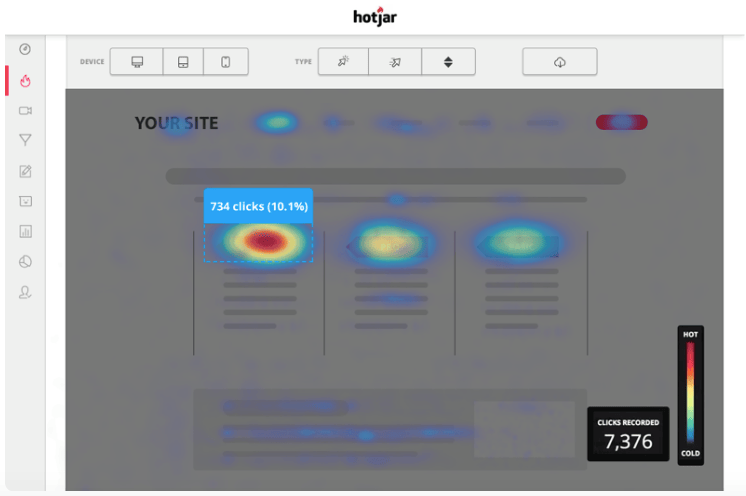
Use a heatmap tool
If you’re willing to spend a little extra, a heatmap tool like Hotjar can show you where visitors are clicking and what their scrolling behavior is. This can indicate whether or not your visual cues are working as intended.
While Hotjar doesn’t track eye movements, it can record site sessions so that you can see what visitors see. It can also show you where visitors are dropping off, which might be helpful for determining where visual cues should go.
Help potential customers get what they want
Visual cues help people sift through information quickly and direct them toward more of the things they want. The prompts you choose for your page and ad designs should speak to your ideal customer and make it easier for them to find solutions to their problems.
By assessing your brand, choosing visual prompts that align with that brand image, and then conducting tests to determine if those cues are effective, you can create a more seamless user experience with your site and ads.
Careful design means more people are attracted to your product, helping you grow your business faster.
ONE TEAM. ONE TOOL.
Powerful email marketing, minus the headaches
Email Marketing plugs directly into your CRM data, so you can create highly targeted audience segments, track the impact of your emails in real-time, and manage all your communications out of a single tool. Get started for free!