Ready to see Nutshell in action?
Attend a live guided tour!
- Every Monday & Wednesday at 10am ET/7am PT
- Every Tuesday & Thursday at 3pm ET/12pm PT

A successful B2B website isn’t just visually appealing—it guides prospects through the buyer’s journey with clear CTAs, intuitive navigation, and content that supports lead generation and conversion.
Use professional branding, trust signals (like testimonials and partner logos), clear value propositions, and compelling copy to establish credibility and move visitors toward decision-making.
Your site should be responsive, quick to load, and easy to navigate across devices to meet the expectations of modern B2B buyers and improve SEO visibility.
Have you ever found yourself scrolling through a website thinking, “Wow, someone designed this?” Granted, what makes a website design good or bad is often subjective, but there is so much more than just the visual elements to consider.
The days of cringe-worthy websites are (mostly) behind us. We lived through MSPaint graphics and amateur GeoCities sites. Now, website builders like Wix and Squarespace make it easy to create decent sites.
Templates and guides exist to prevent amateur web developers from making anything too atrocious, and designers are always around the corner to lend a hand whenever needed—for a price.
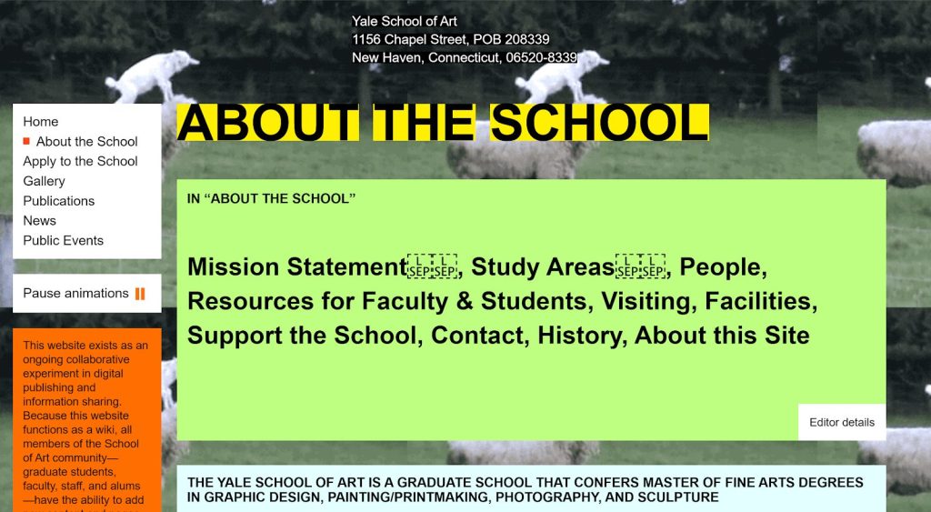
Today, what makes a website design good or bad doesn’t solely depend on how it looks. A good website drives relevant traffic, converts visitors to customers, AND has an easy-to-navigate layout.
💬 ChatGPT
🔍 Perplexity
🤖 Claude
🔮 Google AI Mode
🐦 Grok
Even if all the other aspects of your company are firing on all cylinders, a subpar website could be the difference between business success or failure. When prospective customers feel like a website doesn’t align with their wants and needs, they bounce.

Websites are more than just placeholders for your company’s quarterly updates. A great website drives demand, generates leads, and provides shareable content for your audience—but it’s up to you to get it to that point first.
Before designing or redoing your website, ensure you fully understand your marketing funnel and the route you’d like your prospects to take from beginning to end. This will help you get a sense of which functionalities your website needs, making the design process smoother.
In this blog post, we’ll cover what makes a good website, including the essential elements and pages, and provide actionable tips on how to make a good website—one that drives results for your business.
Website design isn’t just about making things look pretty. It’s about guiding your visitors on their journey, creating meaningful first impressions, showcasing your products and services, and ultimately leading visitors to take action. Quality websites go beyond aesthetics—they prioritize user experience.
An effective web design ensures a seamless and enjoyable user experience. Customers are more likely to engage with you when your website looks appealing and serves a clear purpose.
Your website serves as a virtual storefront for your brand, making it crucial to prioritize certain qualities in its design and functionality. Qualities like:
Elevate your business with a captivating, optimized website that drives sales and enhances your brand!

All websites are made from the same few elements, regardless of how they were created. Your users don’t know if you used a website builder or template, wrote the raw code yourself, or hired a professional web designer to do it for you. What they do care about is whether your site speaks their language and lures them in for more.
Most websites feature the same essential elements across every page. While some industry-specific exceptions exist, like ecommerce or web applications, the most common and substantial types are used repeatedly.
To understand what makes a good website, it’s essential to understand these elements:
To someone unfamiliar with web design, typography might just mean, “Which font should I use here?” To a dictionary, typography is “the style and appearance of printed matter.” A better definition, especially for digital marketers, comes from our pals at CareerFoundry:
“In essence, typography is the art of arranging letters and text in a way that makes the copy legible, clear, and visually appealing to the reader. Typography involves font style, appearance, and structure, which aims to elicit certain emotions and convey specific messages.”
Typography plays a strategic role in captivating audiences and building brand recognition. When a brand or entity consistently uses the same typeface, users will begin to associate the brand and typeface together, creating familiarity and quicker recognition.
Good typography enhances the user experience. Typeface experts can select typefaces and typographical elements that subconsciously align with a company’s tone, style, and voice while remaining aesthetically pleasing and legible. Your fonts and the style in which you use them become your brand.
As an easy example, simple messages might be written with minimalistic fonts in shorter paragraphs, and official-sounding messaging might feature long explanatory paragraphs with a formal font.

When choosing a typeface, shoot for something that is
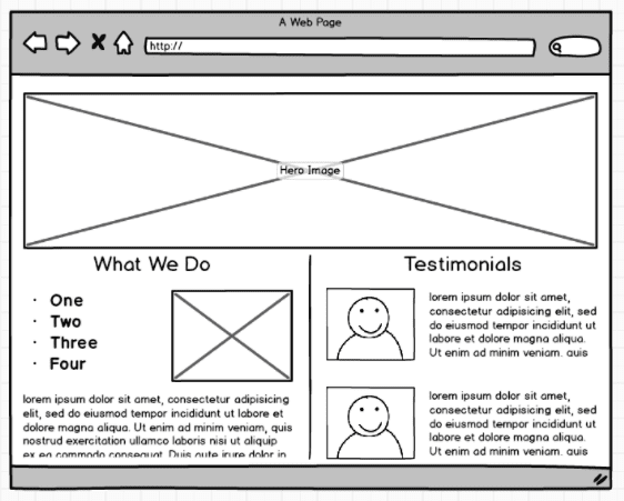
In web design, a hero image is any large, banner-style image that occupies the top of the page so that users see it first upon entry. A hero image should be high-quality and clear so it doesn’t cause any strain or confusion for the users.
Hero images serve as visually appealing landing features that immediately create a good impression on your users. Because of their versatility, a hero image can be just an image or can also feature text and buttons over top of it.
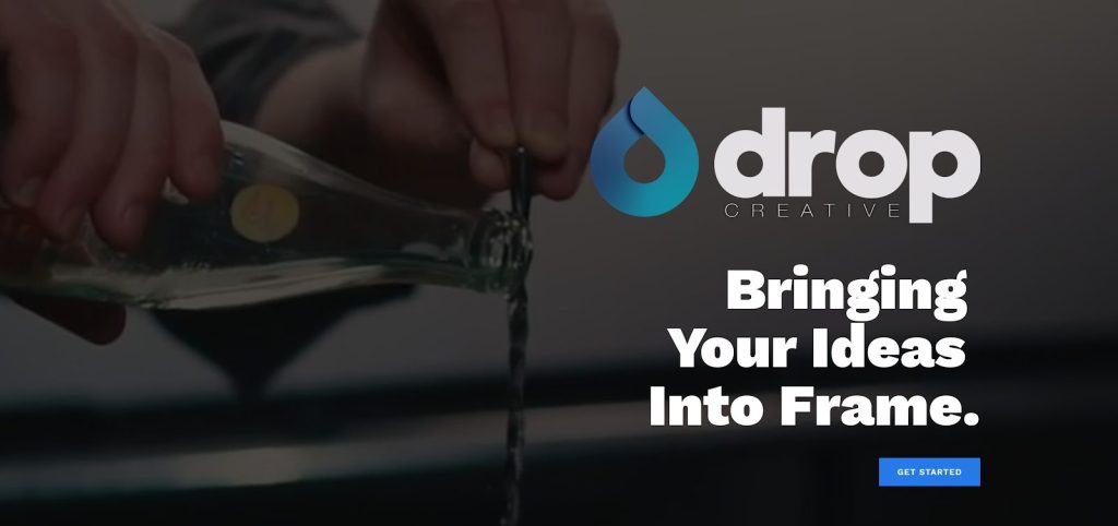
Hero images can be anything from video content to technical graphics as long as they convey the brand’s message well. Some companies use hero images as an opportunity to showcase their products and display their benefits, whereas other companies use hero images to build trust or facilitate emotional reactions. It’s all about using graphics that match your brand.
Pro tip: Hero images with huge resolutions will slow down page loading speed. Be sure to re-size them to screen size.
In marketing, a value proposition is a concise statement that describes why your prospects should do business with you. It should also paint a clear picture of what your company offers its customers.
Value propositions are unlike mission statements in that a mission statement is a static piece of unchanging information, whereas value propositions change to fit each audience.
If you’ve done your market segmentation, you can alter your value proposition in each campaign to ensure it speaks to each audience. Savvy spenders might react favorably to a message boasting a low price tag.

Pro tip: Avoid diluting your value proposition with buzzwords and jargon to facilitate real trust with your audience.
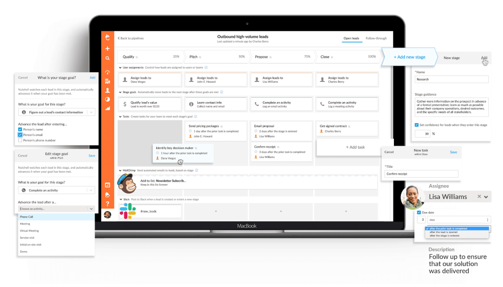
Beautiful technical graphics and process images are a phenomenal way to creatively describe what you do without the need to use words. A good technical image will make a clear point without requiring much of an explanation.
Technical images differ from hero images in two key ways. Where hero images are meant to be a visually captivating way for users to land on a web page, technical images can be used anywhere on a page and are intended to show the product and its benefits in a stylized way.
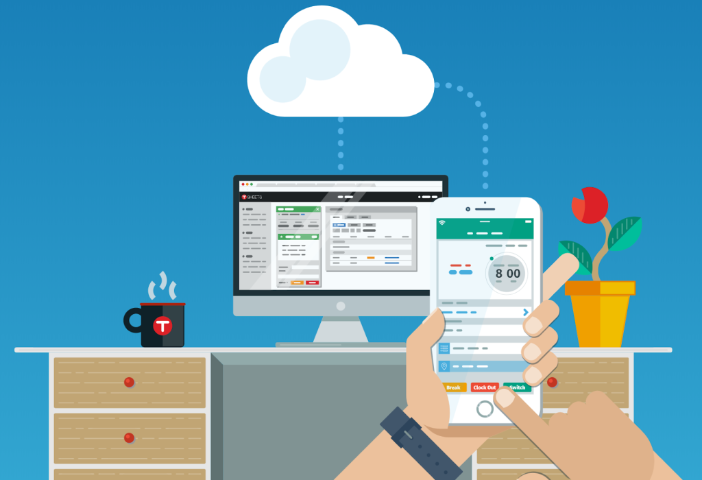
TSheets does a great job using tech photos on their site as a substitute for hero images and icons. The tech photo above clearly shows that TSheets users clock in and out on their phones and then use timesheet management tools on their desktops. This technical image gets an A+ because this is exactly what users do with the software.
One of the more common types of iconography is trust icons of a brand’s clients and partners. Featuring your customers’ logos on your site is an easy way to inform your users of your trustworthiness. This phenomenon is called social proof and is super effective in marketing.
Social proof is the “they tried it, so I’m gonna try it too” phenomenon to avoid an overly-psychological explanation. This is why statements like “40,000 US-based tech companies use our software” are more impactful than “tech companies like our software.” If you’ve got a solid customer base, your future customers need to know.
Icons are tiny pictures used in web design to help users understand content more quickly. Many companies use similarly styled icons across their entire brand to facilitate more widespread recognition from potential customers.
In web design, we generally use icons to:
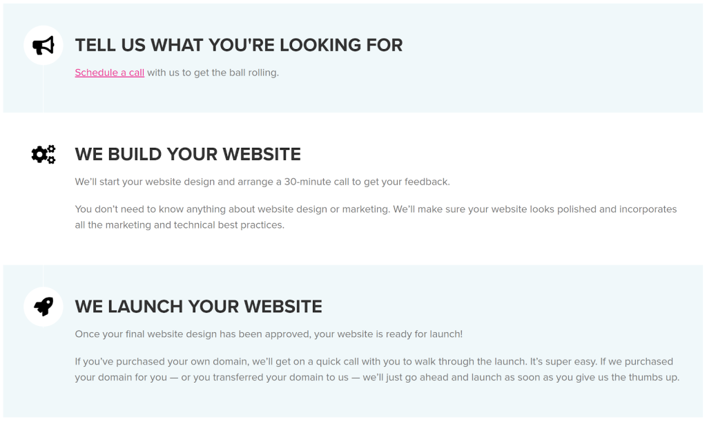
A call to action (CTA) is to marketers what a sales pitch is to salespeople. It’s the marketers’ chance to take their shot and ask for something in return from their audience.
Calls to action aren’t as high-stakes as sales pitches. A typical call to action might be, “Sign up for our newsletter” or “Sign up for our free 14-day trial.” In the worst case, the user simply ignores it—no harm, no foul.
Graphically, calls to action are buttons or links that redirect the user to a new page, form, or download.
A call to action shouldn’t be a heavy lift for your users. Instead, it’s better to pitch relevant ways to keep them engaged without expecting them to commit considerably. For instance, don’t try to sell your product at the end of every piece of content—That’s just spammy.
It’s essential to keep the design exciting and engaging when creating websites. Lots of words, walls of text, and lengthy paragraphs are a surefire way to bore your visitors to death and degrade the quality of your content.
Try to find ways to say more with less. Remember, you don’t have to tell the entire story right on your landing page. If your visitors care enough, they’ll click around and get the whole story.
A few quick blurbs and paragraphs coupled with icons can paint a clear enough picture for your visitors to decide whether they want to learn more. Keep them concise, and save the lengthy writing for lower in the marketing funnel.
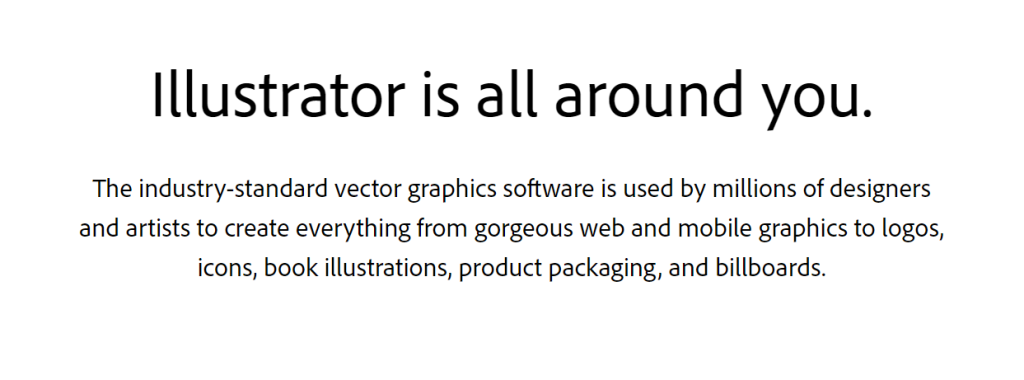
Again, social proof is extremely valuable for boosting your brand’s reputation. If your business has customers willing to be featured on your website, you are in luck.
Customer testimonials can come from another business or a single person, depending on your products or services. The format, however, can be whatever works best in your specific scenario.
Testimonials can exist in the following formats:
Helpful resource: Free case study templates.
A customer testimonial can be used in various ways. Outside your site, you can chop up the same content and post it on social media or use it in advertisements, telling the story as far and wide as possible.
Long-form testimonials, such as case studies, are also perfect content for prospects who are looking for a nudge in the right direction. Hearing a story about a buyer like them might even bump them to the next pipeline stage.
When it comes to graphic and website design, never underestimate the power of thoughtful and intentional white space. Including enough white space in your design ensures it remains balanced and clutter-free. In other words, your website visitors have a clearer view of all the elements that make up your website, enhancing their experience on your site.
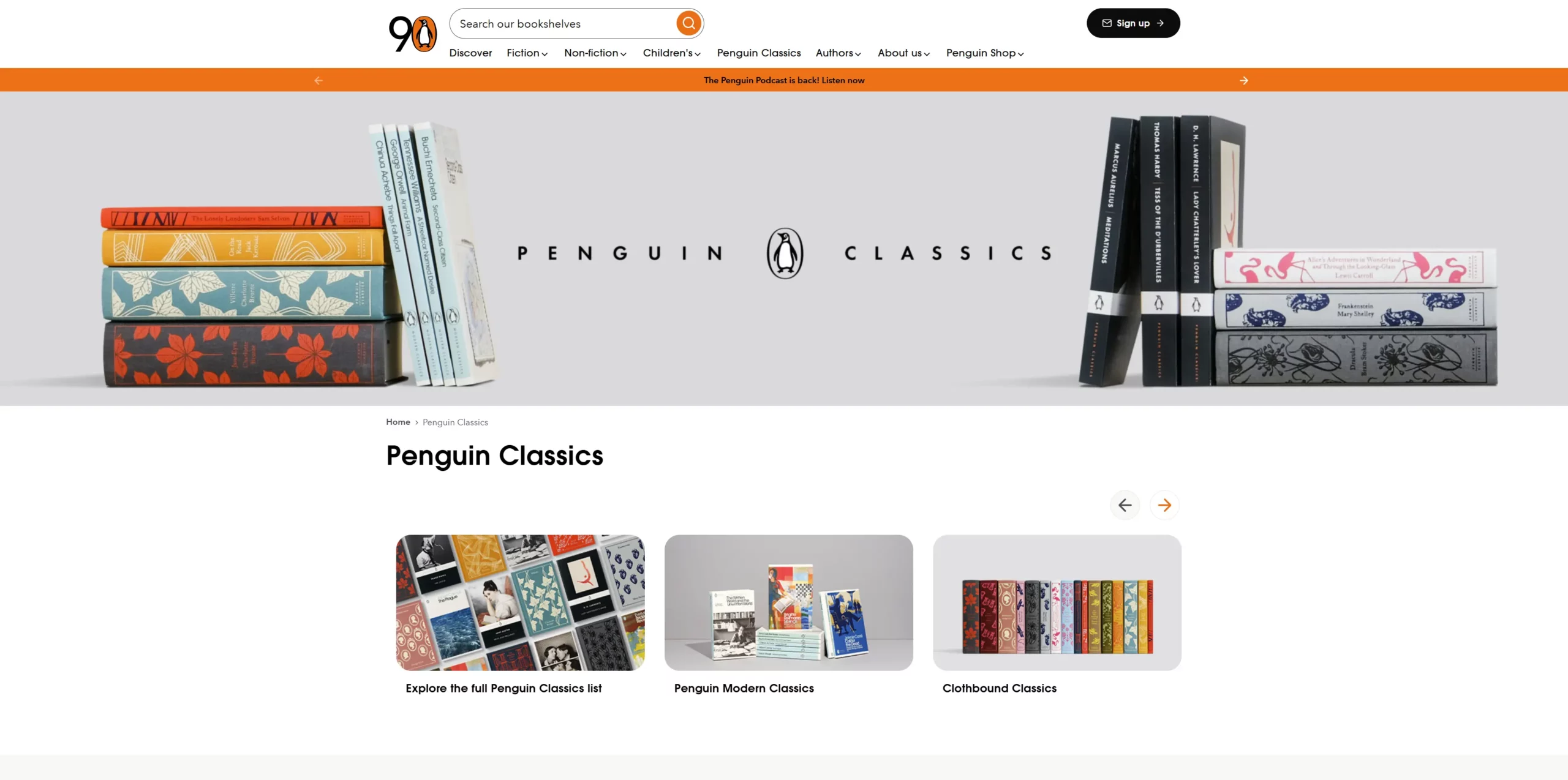
You can use white space to make certain elements stand out over others, leading visitors to focus on them when scrolling through your web pages. It can also help users find exactly what they’re looking for to help solve their problems and answer their questions faster.
While some don’t give their website footer much thought and attention, it’s actually one of the most crucial elements of your site. Many think of it as less important because visitors are less likely to scroll right down to the footer.
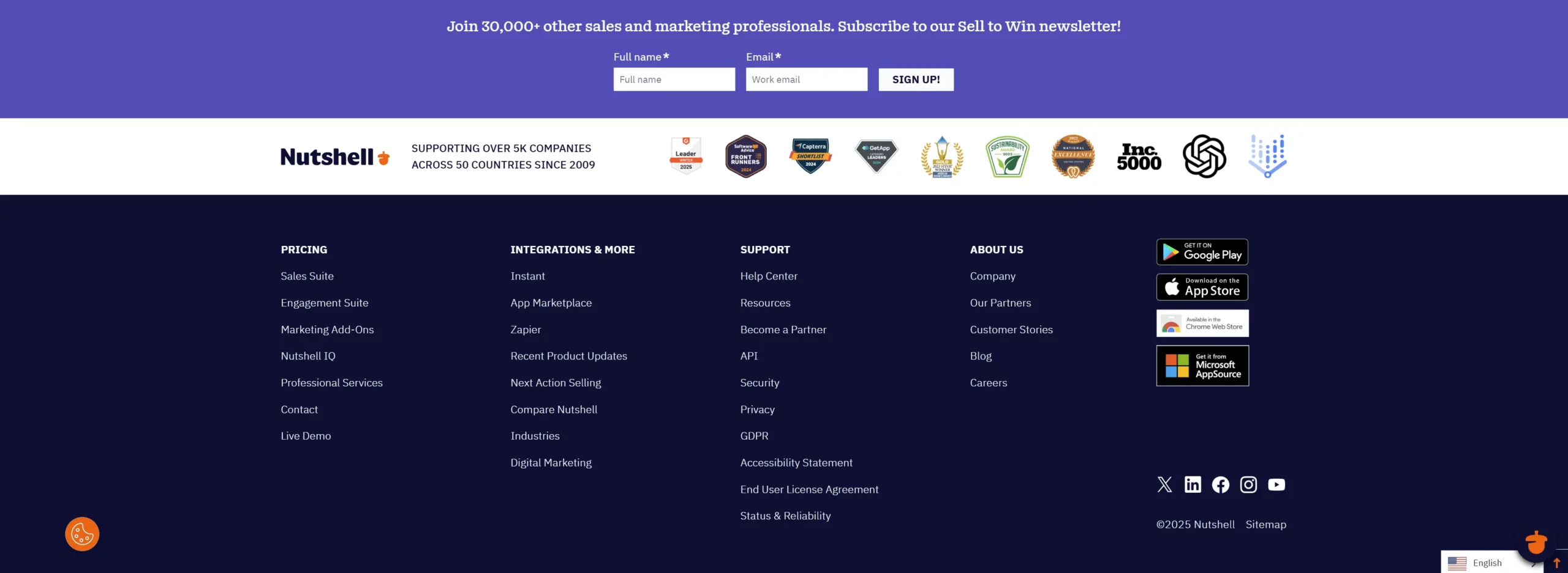
The reality is that those who do often want additional information found deeper in your website, like your terms and conditions, locations, contact information, policies, partners, etc. Often, these individuals are interested in working with your business, making that footer section an asset.

Attend a live guided tour!

Another foundational factor in how to make a good website is the pages you create.
Every page on your website should have a purpose. Whether you’re building familiarity, providing content, or describing your product, every single page on your site needs to provide a specific value.
Consider the depth of each page on your site. Your homepage is at the surface level, and the product and “about us” pages are deeper. Because of this, the content and layout of these pages should match the corresponding level in the marketing funnel.
Below, we discuss three of the most crucial pages to include on your website. Of course, you’ll likely have many other pages, such as blog posts, product pages, and contact pages. If you’re building a new website, though, these are the three to start with as they form the foundation of your site.
Starting from scratch? Check out PCMag’s Best Web Hosting Services for 2025
Your homepage should effectively convey the “big picture” of what your company does and why visitors should do business with you.
This is where your branding takes the front seat, as homepages are often the most visited page on any website. A good homepage showcases your brand’s identity and high-level offerings. The specifics are addressed on the web pages later on.
Pro tip: A good homepage needs to be very aesthetically pleasing. If this isn’t your strong suit, finding a professional designer might be worth it, even if just for this page.

Be sure to keep the verbose explanations on your homepage to a minimum. A “what we do” statement is acceptable, and even some copy to explain how your products work. However, it’s easy to get carried away, which is why the full explanations should exist in the right places, like specific pages about the company itself, the products, the partners, etc.
Be sure to throw your icons in there to jazz up the content. Good iconography can help to break up your value statement, signify different products or services, and provide spacing and relief to your homepage’s overall design.
A good homepage is also optimized for easy navigation. Visitors should be able to follow whichever path appeals to them most without being confused by tons of options and offers—save those for the lower (in the funnel) pages.
Lastly, the homepage needs clear CTAs so visitors don’t hit a dead end. The first CTAs should be placed after the value propositions, roughly in the center of the page. The second CTAs go at the bottom of the page so visitors don’t have to scroll back just to continue on the website. If your page is small, stick with one CTA at the end.
Give Nutshell CRM as well as Landing pages and our other marketing tools a try by starting your 14-day free trial today.
A landing page is a tactical page created as part of a marketing campaign. The landing page’s URL is then featured as a CTA in a newsletter, PPC ad, or other promotional content. When users click the URL, the click is tallied, and the campaign’s effectiveness is measured accordingly.
Because of their strategic purpose, landing pages don’t have the same open-endedness as homepages. As part of a marketing campaign, a landing page features one specific offer and thus has only one CTA.
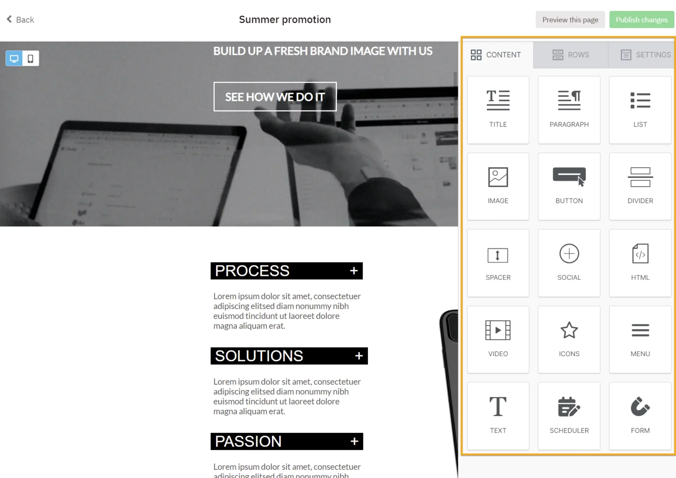
A landing page’s sole purpose is to get visitors to convert by clicking its CTA. Paragraphs, company descriptions, and other content can distract from the goal. Keeping your landing page design minimal and streamlined is the best approach. It’s all about that CTA.
Finding a user-friendly landing page builder is essential—This will streamline the design process and make it easier to create striking, professional landing pages without employing a specialist designer.
An all-star landing page typically includes the following core elements:
Bonus: Check out this handy guide to landing page builders.
Practically every company has a page about themselves. Usually, an About Us page will describe things like what the company does, how they were founded, who works there, and what its mission is.
Blue Acorn reports that customers who visit an About Us page are five times more likely to make a purchase than those who don’t. Furthermore, customers who visited an About Us page spent a reported 22.5% more on their purchases. Why is this?
There are two leading theories, both of which may be true in different cases. The first theory is that customers who are already about to purchase something tend to visit the About Us page to see exactly who they’re buying from, mainly just out of curiosity.
The other theory is that the About Us page is a compelling piece of content in and of itself, and people who visit it are likely to convert because of its content alone.
In terms of page design, the About Us page is a flexible one. Some companies take a graphical approach, featuring photos of their employees and workspace. Other companies take a verbal approach and center around the company’s story, using photos as a secondary form of content.
Whichever approach you decide to take, try to design the page around the questions your prospective customers might be asking:
Creating websites is about building a brand that supports your messaging and drives prospective customers into the marketing funnel. From ecommerce to talent portfolios to B2B sites, the specific elements vary, but the fundamentals remain the same.
You now understand the essential elements and pages that make a good website. You’re totally qualified to hop on WordPress and start making your own, but if you’d prefer to work with professionals, consider our partners at WebFX.
WebFX has designed over 1,200 performance-driven websites and offers a full suite of other digital marketing services, so you can get everything you need to grow your brand, increase your visibility in search, and drive conversions with your website.
Invest in professional marketing services from WebFX and kick your company’s growth into high gear.


Join 30,000+ other sales and marketing professionals. Subscribe to our Sell to Win newsletter!