How to Create a Great Call to Action for Your Next Email Marketing Campaign
-
Last updated on: May 7, 2026

Key takeaways
- Craft high-converting email CTAs by understanding your audience and tailoring your message to their specific needs and motivations.
- Use action-oriented language, highlight the benefit to the reader, and create a sense of urgency to inspire immediate action.
- Make your CTAs visually prominent with button-style designs, strategic placement, and test variations to continuously optimize performance.
You work hard to craft awesome content for your growing list of email subscribers. But for some reason, they won’t click through to your blog posts and product offers. What gives? Well, there might be a problem with your email marketing campaign call to action.
Even if you have the best newsletter in the world, it won’t make a difference without convincing calls to action.
Professional marketers even struggle to craft good CTAs for their email marketing campaigns. Fortunately, there are a few simple things you can do to design better calls to action that generate more clicks for your business.
What’s a call to action in email marketing?
A call to action (CTA) is text, a button, or a link that prompts an audience to do something—get more information, download a product, buy a service, etc. In email marketing, this CTA is located in an email.
A CTA can look like a button that says something like “Buy Now” or “Learn More.” Or it can be simple hyperlinked text that says, “Download now for all the latest tips.” In fact, a CTA can be almost anything as long as it prompts the reader to do something specific.
Summarize with AI:
Example email marketing CTAs
There’s a lot of freedom when it comes to creating an email CTA that converts. Here are a couple of examples to get you started:
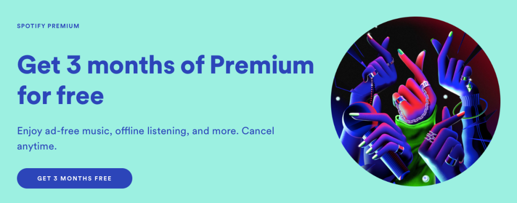
Source: Spotify You know what everybody loves? Free stuff. That’s one of the reasons why this is a good CTA from Spotify. People who land on the company’s homepage are obviously interested in a music streaming service. And the chance to subscribe for free for three months is quite enticing.
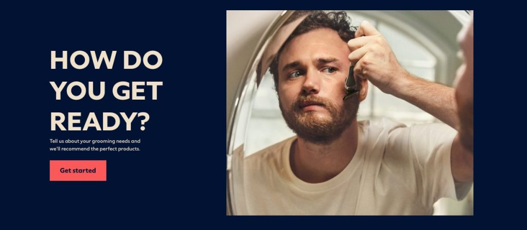
Source: Dollar Shave Club “Get Started” isn’t a good CTA by itself. But Dollar Shave Club’s text before its CTA button is compelling and makes for an effective combination.
This is super important to keep in mind when discussing email CTAs! Why? Because the button or hyperlink text you place at the end of your email is only part of your call to action. It’s the climactic moment, for sure. But if the body text of your email doesn’t put your subscribers in the right “mood,” they’ll never click your CTA.
10 tips for how to write a good call to action
So, how do you write a call to action that people actually want to, you know, click on? Here are 10 tips to help you craft good CTAs that propel your business forward.
1. Understand your audience
Before you can write a good call to action, you have to have a firm grasp of the basics, i.e., a strong understanding of your target audience. All good marketing starts with an in-depth understanding of the people you’re trying to reach. Who are they? What do they like and dislike? Why do they read your emails in the first place?
If you can’t answer these questions, you need to take some time to study your customers. Then, put together buyer personas, including demographic information like age, gender, and occupation, and include psychographic details like their hopes and fears.
2. Know your CTA’s purpose
Next, make sure every email CTA you write has a specific purpose. What do you want people to do after they read your message? Download something? Buy a product? Invest in your services? Follow your brand on social media?
Once you identify the goal of your message, it will be much easier to craft CTA copy that leads your subscribers to the action(s) you want them to take.
ONE TEAM. ONE TOOL.
Powerful email marketing, minus the headaches
Nutshell Campaigns plugs directly into your CRM data, so you can create highly targeted audience segments, track the impact of your emails in real-time, and manage all your communications out of a single tool. Get started for free!
3. Write in the first person
This tip might not be the most obvious, but it can result in huge benefits. Using first-person rather than second-person language helps recipients envision themselves completing the action and even gives them ownership over the result.
For instance, it’s worth saying, “Start my free trial” rather than “Start a free trial” and seeing how that impacts your click-through rates.
4. Use action-oriented wording
It should come as no surprise that a CTA needs action-oriented language. Seeing “Download our Guide to Email Marketing” on a button is more convincing and less confusing than just “Guide to Email Marketing.” Using a verb makes all the difference.
Action words tell email recipients exactly what will happen when they click the CTA. This ensures them that there won’t be any sneaky surprises and can help persuade them of the benefits. Here are a few examples:
- Get my discount
- Reserve my seat
5. Promote the benefit
Your call to action copy is super important. In fact, the words you use can make or break your CTA. If you want people to click your CTA, you have to give them a compelling reason to do so.
Ask yourself, “What benefit will my subscribers receive in exchange for clicking on my CTA?” Then use words that convey this benefit as clearly as possible.
For example, if you wanted your subscribers to download a free eBook on Instagram marketing, you could end your message with a CTA that says “Download Now.” But if we’re being honest, that’s pretty generic and not all that interesting.
Instead, use a CTA like “Learn to Use Instagram Like a Pro” or “Make Money With Instagram.” Both of these are good CTAs because they promote benefits.
6. Create urgency
Another way to increase clicks is to create a sense of urgency. This is pretty easy to do if you’re running a sale or have a limited stock of certain items. A CTA like “Get Them Before They’re Gone” hints to the reader that they might miss out if they don’t act now.
You can also create urgency by raising the stakes of your offer. For instance, you could say, “Try It Before Your Friends,” which subtly suggests to readers that being the first of their social group to try something is beneficial. But they better jump on the offer ASAP.
7. Use the right placement
There isn’t a right and wrong place to put your CTA in an email. But it’s a good idea to put one above the fold—that way people can clearly see the email’s call to action before they scroll.
CTA placement is also determined by how recipients will naturally look over the email. Because we read left to right, a CTA at the bottom and toward the right of your email could result in higher conversions.
And make sure the other text, images, buttons, and design elements in your email don’t distract from the call to action. It is, after all, the main thing you want recipients to see and do.
8. Make it a button
The way your call to action looks is important, too. But don’t worry. You don’t have to be a professional designer to get this aspect of your CTA right.
Your email CTAs can appear in various ways. You can go the minimalist route and simply hyperlink a bit of text. You can get extra fancy and allow subscribers to click an image that will take them to a certain web page. Or you can make your CTA look like a button.
Pro tip: In most cases, your best bet is to make your CTA look like a button.
Why is this? It’s simple: buttons are made to be clicked. Your audience knows this, so as soon as they see your CTA button, they’ll automatically know what you want them to do.
In addition, buttons are easy to see—especially if you give them an eye-catching color. (More on colors below.) This is important because so many people check email on their smartphones. By creating CTA buttons, you ensure your audience can see them on a small screen.
9. Catch your reader’s eye
You can write the best CTA in the history of good CTAs, but if your subscribers can’t see it, it doesn’t matter. That’s why you need to commit to eye-catching design with your different types of marketing emails.
Here are four ways to make sure your design hits the spot:
- Contrasting colors: Your CTA button should stand out from the rest of your email. This can be done by choosing contrasting colors. For example, if your email background is white, give your CTA a bright color.
- Appropriate size: How big should your CTA button be? Big enough to easily notice, but not so big that it annoys your readers. This is really a judgment call. Test a few different sizes and pick the one that’s most visually appealing. Note: if your CTA distracts from your email’s body text, it’s probably too big.
- Proper placement: Where you place your CTA should depend on the complexity of your offer. If your offer is easy to understand, place it near the top of your message. That way, your subscribers don’t have to scroll to click it. If your offer is complicated, place it at the end of your email as this will give you ample time to explain benefits.
- Blank space: Lastly, make sure your CTA button, wherever you decide to place it, is surrounded by blank space. This makes it easy for subscribers to see. Just don’t go overboard. Too much blank space could lead readers to believe your body text and CTA button aren’t connected. Again, use your best judgment in this area.
10. Test and track CTA success
Testing your CTA with an email A/B test is a great way to measure its success. You can test the copy, color, and placement of your CTA against another version and see which one gets the most clicks from a segment of your recipients. Then, send the winning variant to the rest of your campaign’s audience.
Finally, tracking important email metrics like click rate over time is critical to continue improving your CTAs. Your email marketing platform should enable you to see how many clicks each link in your email received and even find the exact people who clicked so you can reach out individually.
Frequently asked questions about email marketing CTAs
Still curious about how to craft the most eye-catching email marketing CTAs? These questions might have the answers you’re looking for:
Can a call to action go at the beginning of an email?
There’s nothing stopping you from putting your CTA toward the top of your email—but consider whether that’s likely to convince your recipient to act. Do they know enough about the action you’re asking them to take? Usually, it’s better to place a CTA after you’ve done some explaining.
Should every email have a call to action?
If you want the best results from your email marketing campaigns, yes—but not just because. Every email should be crafted to nudge the recipient further down your sales funnel, which often means you need them to take another step. With the correct CTA, you’ll have more and more people following your lead!
How many calls to action should be in an email?
There’s no magic number for how many CTAs you should have in an email, but having too many can slow down and even overwhelm recipients. You should likely have between three and six, and each one should have a good reason for being there.
How can I increase the success rate of an email CTA?
When your email copy is clear, focused, and persuasive, you increase the chances that someone will click on your CTA. You can also use email design elements like color and text size to draw the right amount of attention to your CTA button or text.
Now it’s your turn
If you want to succeed with email marketing, you have to learn how to create a good call to action. It’s not as hard as it sounds. Simply implement the 10 tips outlined in this article, and you’ll begin to generate more clicks with every message you send. 💪
Nutshell Campaigns is the email marketing platform built right into Nutshell CRM. Nutshell Campaigns lets you design beautiful emails that convert recipients and provides analytics for every email and newsletter so you can continue optimizing your campaigns.
Plus, you can see how many clicks your CTAs received and uncover the individuals who clicked them. And because Campaigns works hand-in-hand with Nutshell, you can reach out to your subscribers and win more deals.
Want to see how Nutshell can help your team generate and win more opportunities? Sign up for your free 14-day trial today!
NO CREDIT CARD REQUIRED
Haven’t started a trial yet? Let’s fix that.
Try Nutshell free for 14 days and start selling smarter.
FAQs on Creating Good CTA for Your Email Campaign
-
What is a CTA in email marketing?
A call to action (CTA) is the text, button, or link in your email that prompts readers to take a specific action—like “Buy now,” “Download the guide,” or “Start my free trial.”
-
Why do CTAs matter so much?
They turn attention into action. Even great emails won’t convert without a clear, compelling next step that’s easy to see and click.
-
How do I choose the right CTA goal?
Start with your campaign objective (e.g., purchase, signup, download). Define one primary action and write your CTA to directly lead to that outcome.
-
Should I write CTAs in first person or second person?
First person often outperforms (“Start my free trial” vs. “Start a free trial”) because it helps readers imagine themselves taking the action.
-
What kind of wording works best?
Use strong, specific action verbs plus the benefit: “Get my discount,” “Reserve my seat,” “Download the playbook.” Make the next step obvious.
-
How do I highlight the benefit in my CTA?
Tie the action to an outcome: “Learn to use Instagram like a pro,” “Save 25% today,” “Grow qualified leads.”
-
How can I create urgency without being spammy?
Use honest scarcity or time cues: “Enroll before seats fill,” “Ends tonight,” “Limited stock.” Keep it truthful and relevant.
-
Where should I place my CTA?
Include one above the fold and another near the natural conclusion of the email. Readers scan left-to-right and top-to-bottom, so right-aligned or end-of-copy buttons can perform well.
-
Should my CTA be a button or a text link?
Buttons typically win. They’re visually obvious, mobile-friendly, and signal clickability. Use text links sparingly for secondary actions.
-
How do I make my CTA stand out visually?
Use a contrasting button color, ample whitespace, clear label text, and a size that’s noticeable but not overwhelming. Test different sizes.
-
What about mobile optimization?
Ensure buttons are large and tappable (at least ~44px tall), spaced from other links, and visible without zooming. Test on multiple devices.
-
How many CTAs should I include?
One primary CTA per email is best. If you add secondary CTAs, style them less prominently to avoid distraction from the main action.
-
What common CTA mistakes should I avoid?
Vague copy (“Click here”), hidden or low-contrast buttons, too many competing CTAs, no clear benefit, and burying the CTA below long copy without an above-the-fold option.
-
Which metrics tell me if my CTA is working?
Click-through rate (CTR), click-to-open rate (CTOR), conversion rate on the landing page, and downstream revenue or sign-ups.
-
How should I A/B test CTAs?
Test one variable at a time: copy (first vs. second person), benefit framing, button text, placement (top vs. bottom), and button size. Keep sample sizes sufficient to reach significance.
-
Can I personalize CTAs?
Yes—use audience segments and CRM data to tailor benefits (“Get my nonprofit discount”), reference roles or pain points, and align offers with past behavior.
-
What are some example CTAs for common goals?
- Purchase: “Get 25% off today,” “Add to cart now”
- Demo/trial: “Start my 14‑day trial,” “Book my demo”
- Content: “Download the playbook,” “Watch the 5‑minute tutorial”
- Event: “Reserve my seat,” “Save my spot”
- Newsletter: “Join 20,000+ marketers,” “Send me weekly tips”
-
How does email copy around the CTA affect clicks?
The CTA is the climax, but the body copy sets context and desire. Lead with the reader’s problem, present the benefit, then present the CTA as the obvious next step.
-
Any accessibility tips for CTAs?
Use high color contrast, clear button labels (not just “Click here”), adequate touch targets, and meaningful link text for screen readers.
BACK TO TOPWritten by Jacob Thomas Contributor, Sell to Win
Ready to try
Nutshell for Free?Thank you! Your submission has been received!Oops! Something went wrong while submitting the form.
Sales Performance Reviews: 9 Tips to Make Them Valuable
Published on: November 10, 2022Highly Effective Strategies for Elevating Sales Team Performance
Published on: November 10, 2022What Are the Top 3 Go-To-Market Strategies?
Published on: November 10, 2022Join 30,000+ other sales and marketing professionals. Subscribe to our Sell to Win newsletter!
- Product
- Nutshell Overview
CRM & Sales
Our powerful and easy-to-use flagship product.Marketing
Email marketing, forms, landing pages, and more.Engagement
Your omni-channel inbox in your CRM.Prospecting
Prospect for new leads and new contacts in your CRM.Quotes & Invoices
Quickly create quotes & invoices in your CRM.
AI
See why Nutshell is the leading AI CRM.Integrations
Connect to Google/Microsoft and over 5,000 Apps. ReportingCreate reports and forecasts in an instant.
CRM Advisor
Get a dedicated point of contact to get the most out of Nutshell.Partner Marketplace
Find trusted partners to help optimize your Nutshell CRM.
- Pricing
Nutshell AI
- Resources
- Contact Us
Contact Sales
Send us your questions or book a 1-on-1 demo.Join a Demo
Join a group demo for a general overview of Nutshell.
Contact Support
Contact our support team via live chat in app or via email.Become a Partner
Refer businesses to Nutshell & earn commissions.
Contact Marketing
Questions about our website or our marketing opportunities?Careers
Join our growing team! See current openings.
