
Good contact forms are simple, mobile-friendly, and only ask for essential information like name, email, and a message or specific inquiry. The best examples include clear labels, helpful placeholder text, a strong call-to-action button, and minimal required fields to reduce friction and increase conversions. Effective contact forms also set expectations about response time, include privacy assurances, and make it easy for visitors to reach you without feeling overwhelmed by unnecessary questions.
Well-designed contact forms aren’t just passive tools—they’re powerful lead generation engines that can accelerate sales conversations and improve customer experience.
Smart form design includes using dropdowns, limiting the number of fields, and providing clear microcopy to boost completion rates and route inquiries effectively.
B2B companies should treat contact forms as strategic assets—customizing them by purpose (like quote requests or booking forms) and optimizing them through testing and CRM integration to maximize ROI.
You’re creating a contact form for your website, and you want it to look so good that your visitors can’t help but fill in their details for more information about your products and services. What better way to ensure your web form hits the mark than to browse some of the best contact form examples out there before flexing your creative muscles?
Crazy as it may seem, the trusty contact form is one of the most neglected website components, often a mere afterthought. But the reality is that your contact form has the potential to be your number-one lead generator.
When you put some thought and effort into contact form design, it becomes a powerful tool for capturing leads and increasing conversions.
This post will delve deeper into what makes for a great contact form and showcase some excellent web form examples to give you the inspiration you need. But first, let’s define the term “contact form” so we’re all on the same page.
A contact form is a type of web form included on your website, giving visitors an easy way to get in touch with your team. Visitors can complete the form to send you a sales inquiry, request customer support, feedback, and much more.
You can customize your contact form to include fields that provide you with the prospect and customer information you wish to gather. Some of the most common form fields include first name, last name, email address, and message.
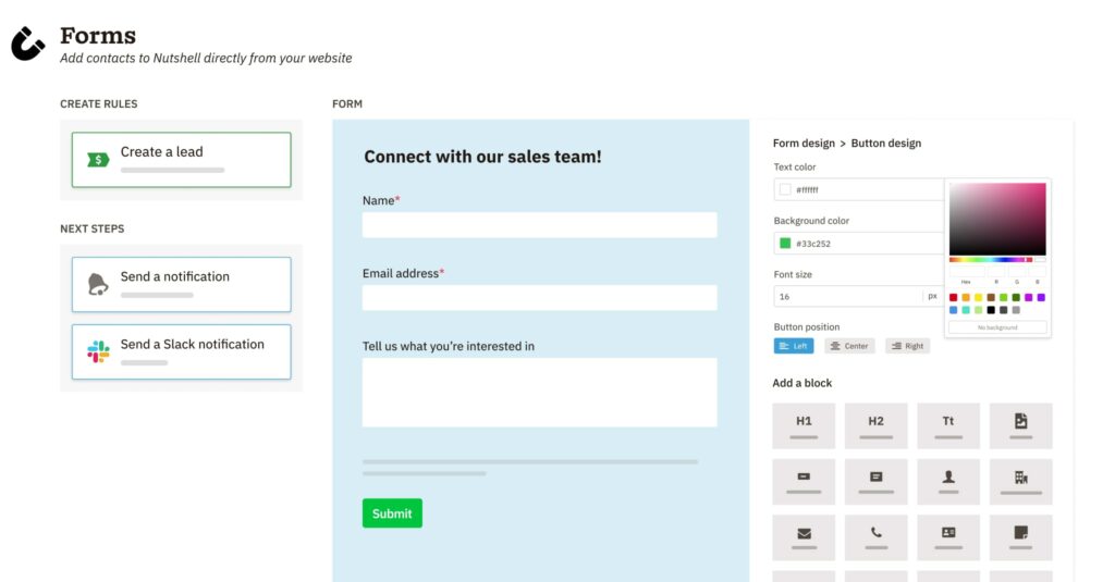
Use Nutshell Forms, an easy-to-use form builder that fits right into your CRM.

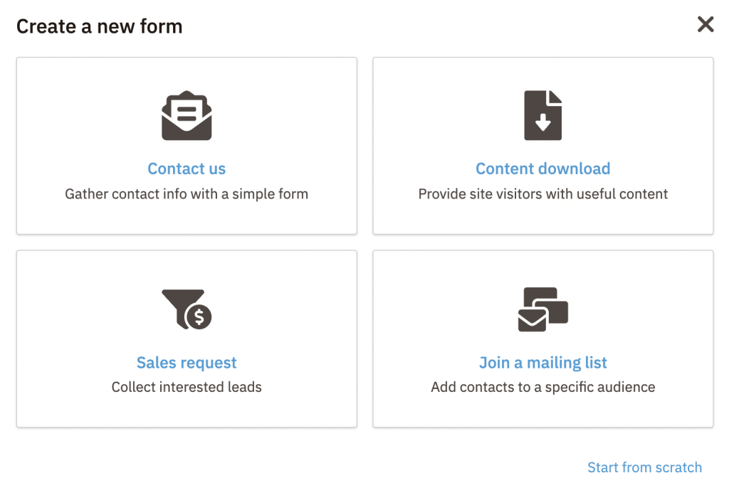
Contact forms typically fall within one of five primary web form categories. The purpose of your form determines its category, which includes the following:
Why should you include a contact form on your website? How does it benefit your business? Well, incorporating contact web forms into your web design plan can be a huge advantage and benefit your business in the following ways:
If a visitor takes the time to complete your contact form, it’s a sure sign they have some interest in your products and services. Providing a simple, easy-to-find contact form for a quick inquiry or feedback is the best way to encourage users to get in touch.
Including required fields for basic contact information, such as name, email address, and phone number, gives you everything you need to capture the visitor as a lead and reach out to them.
Whether you intend to send out cold emails, newsletters, broadcast messages, or targeted drip sequences to your mailing list, email is still one of the best ways to build relationships with your prospects.
Including an email address field in all your contact web forms ensures you gather the email addresses of visitors who have shown interest in your product or service. This gives you the opportunity to keep the conversation going and engage with your leads.
You can set up notifications so you’re alerted as soon as a message from your contact form drops in your inbox. This way, you’ll never miss an important message or inquiry from a prospect or customer.
It also gives you the ability to respond to those messages quickly, which is a great way to impress website visitors and build trust.
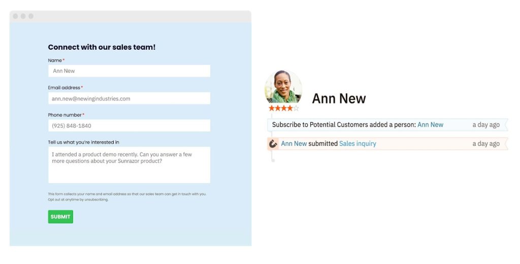
Having messages and inquiries funnel through your website via a contact form is a great way to streamline inbound leads. With everything coming through a single channel, you can easily monitor the influx of leads, organize their data, and access information quickly from one place.
Integrating your web form with your CRM gives you the power to capture, sort, and assign leads effortlessly, ensuring no prospects slip through the cracks. If you invest in a top-tier CRM like Nutshell, you’ll have access to an intuitive built-in web form builder with the ability to automate some of these tasks, saving you and your team time.
Including a contact form on relevant web pages is an ideal way to offer customers support when they need your assistance. Adding and customizing form fields requesting specific information and offering the option to upload an image may help your team pinpoint the issue and provide a solution faster.
It’s also important to respond to customer support requests as quickly as possible to ensure your customers have the best experience possible when dealing with your brand.
While adding a basic contact form on your website’s Contact Us page will encourage some engagement, approaching your forms more thoughtfully will garner more success.
Ideally, you should consider where you intend to place the form, its purpose, and whether you expect to receive various types of communication through it.
Focusing on some specific contact form design elements could be the difference between a lead-generating machine and a white elephant. These are some of the critical aspects to consider when crafting your contact forms:
Think about what your web visitor may want to contact you for and design your form to facilitate those queries.
For instance, you could offer a dropdown menu allowing visitors to select the query type that best aligns with their message. Or you might design a series of forms directing the visitor from one to the next based on their chosen options.
Categorizing your incoming messages this way makes for more effective sorting and distribution when multiple departments are involved. It also opens the door for designing forms tailored to the customer or prospect’s needs.
Research suggests that the fewer the number of fields in your contact form, the greater the chance of visitors completing the form. And it stands to reason that your audience would want to waste as little time filling in a form on your website as possible.
While a form with three fields seems to be most attractive to visitors, marketing experts recommend creating forms with between five and eight fields at most. This approach offers the best way to gather quality leads with the information you need to take the relationship to the next level.
Basic form fields like “Full Name” and “Email Address” are clear, requiring no further explanation. However, your website contact form may include fields that visitors could interpret in different ways or may request information using industry-specific jargon.
In these instances, it’s best to include microcopy at these points on the form. Microcopy comprises short explanations per field, clarifying the information the visitor should include in that field.


From button color and text to different fields, layouts, and graphic elements, testing different versions of your form is a great way to gauge how visitors respond to and engage with it.
You could even experiment with how your visitors access your form, such as where you place your “Contact Us” or “Sign Up” CTA button.
Bear in mind that when testing different contact form elements, ensure you test only one aspect at a time. Trying multiple variations at once will make it hard to identify what worked and what didn’t.
There are two components to managing your client’s expectations related to web form submissions.
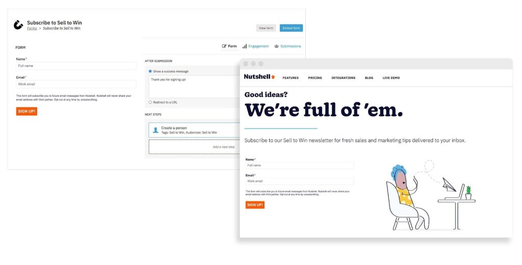
First, you’ll want to make sure your website visitors know when their form submission attempt was successful. This avoids leaving them guessing, wondering whether the form works correctly and if their message has gone through.
Then, let your prospects and customers know when they might expect a response. A “Contact Us” page example may include directing visitors to a second page after submission, thanking them for contacting you, and stipulating that you’ll be in touch within 24 hours via email.
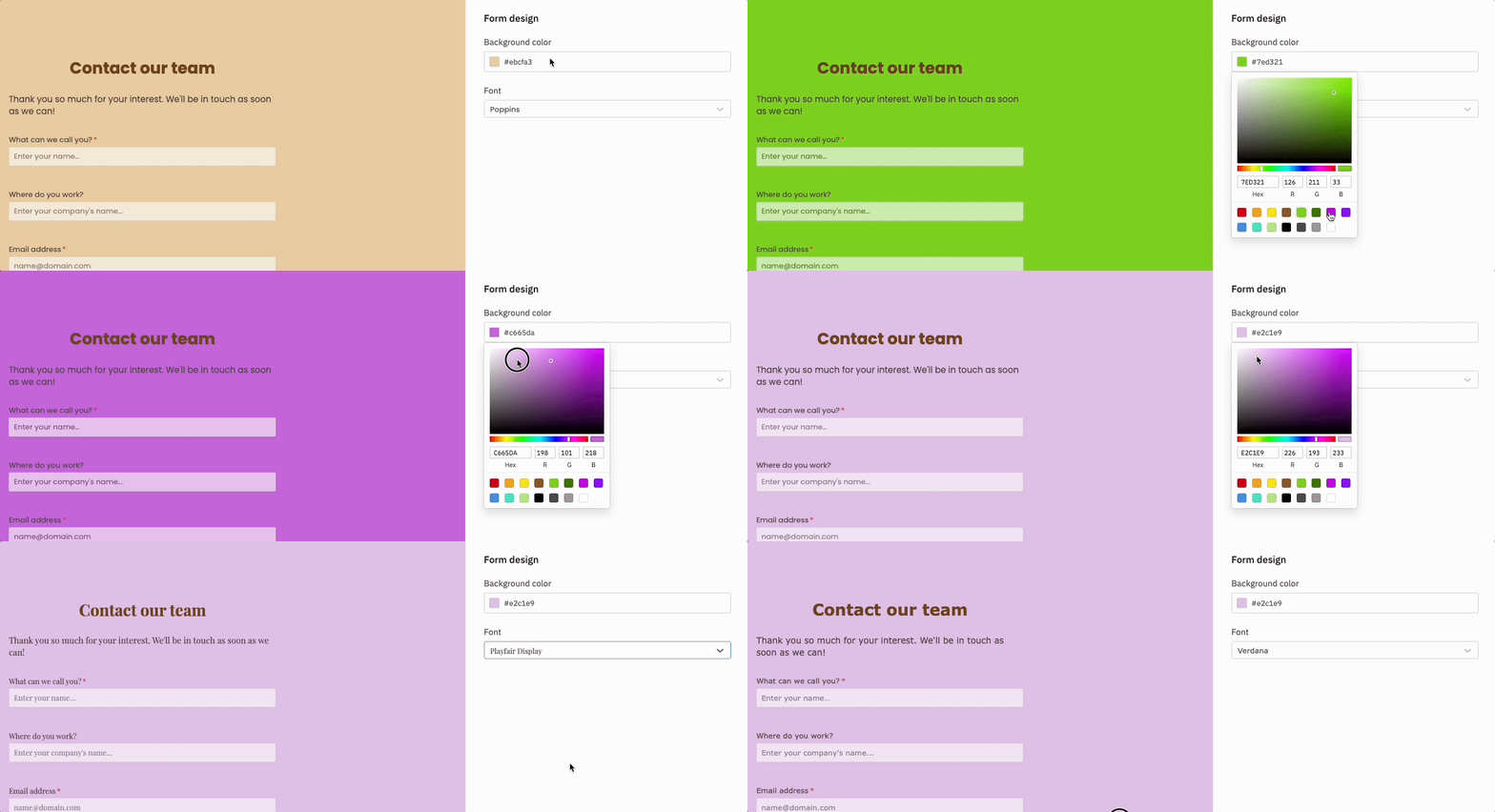
Need some inspiration? We’ve compiled a list of some of the best website contact page examples from across the World Wide Web, to get your web form design rolling.

Neil Patel is a renowned marketing expert with a busy website chock-full of useful information for businesses and marketers. Given the popularity of his website, Neil receives a fair amount of messages through it.
His website contact form is the perfect example of a clear and simple form that’s actually packed with more options and information than meets the eye.
Clicking on the first “I’d like to chat about…” field in this contact form sample reveals a drop-down menu with several message subject options. Selecting a subject here undoubtedly helps Neil sort, categorize, and prioritize his inbound mail.
After selecting a subject, all that’s left to do is input your name, email address, and a brief message—Neil uses microcopy in the message field to specifically ask visitors to keep messages “short & sweet.”

Omsom’s website Contact Us page is a perfect example of ensuring every customer touchpoint aligns with your brand voice and image. This Vietnamese noodle brand lets its brand personality shine through, using playful graphics and wording.
Despite this, the information provided is straightforward, letting visitors know exactly how to get in touch for various queries and offering a clear CTA for users to sign up to receive Omsom emails.

You’ll find another uncluttered, clean Contact Us page example on ban.do’s website. Ban.do’s web contact form has upped the customer experience ante with bright, on-brand colors and a cool, original GIF as the form header.
The company clearly stipulates above the form that visitors can use it to get in touch regarding pretty much anything. There’s no confusion about what information to provide and where to input it—simply fill in your name, email address, and message, and hit Send.
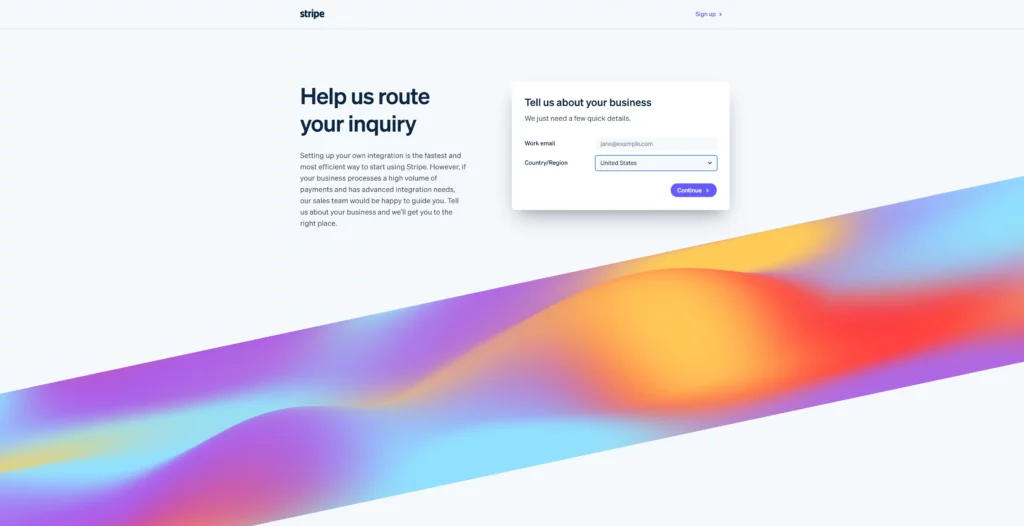
Our next website contact form sample lives on the Stripe website. This is the sales contact form or at least the first part of it. Stripe employs a form series approach here, which leads the visitor through a series of questions.
After inputting your name and country/region, the form leads you to a second, more comprehensive form requesting detailed information, including job function, job level, and a work phone number.
While it may seem like overkill, the series allows Stripe to gather comprehensive lead data and qualify those leads at the same time—only those genuinely interested in the service will likely complete the web form series.

Kinsta’s Contact Us page is a great contact form sample showing us one of the ways you can offer multiple contact channels and additional information in a sleek and compact manner. Phone the Kinsta sales team, hop on a live customer support chat, send a web form message, book an appointment, or WhatsApp the team without leaving the Contact Us form page.
Selecting “Send us a message” or “Book an online appointment” reveals different types of contact forms, each designed with its purpose in mind.
Sending a message simply involves providing your full name, email address, and message. On the other hand, you’ll book an appointment through a web form series, starting with your email address and a Start Booking button, which connects you with a representative and further steps to firm up the appointment.
Kinsta stipulates that its team will respond to your message within one business day, making it a great example of managing visitor expectations through the website contact form.

Navigating to the Moz Contact Us page gives you the option to click on their “Contact the Help Team” button, which directs you to a neat and slick contact form. The SEO giant provides an uncomplicated form with a dropdown menu at the top, letting users select exactly what they’d like help with.
The menu in this contact form sample helps the visitor and the Moz team tremendously—Moz offers a host of products and services, so selecting the appropriate item ensures the right team receives the message and prevents the user from grappling with different forms, email addresses, etc.

Search Engine Journal’s (SEJ) Contact page gives visitors a no-frills, no-hassle web form. This website Contact Us page example delivers eye-catching, brand-aligned graphics, smart message category display, and fields for additional information.
Users have no less than eight categories to choose from to the left of the form and six categories within the form, ensuring the message ends up in the right hands. They can also upload screenshots or images to their message through the form.
Another interesting SEJ contact form feature is the inclusion of Google’s reCAPTCHA fraud detection system. This feature prevents spam, bots, and similar malicious automations from getting messages through and ensures only inquiries sent by humans reach their team.
In awe of the amazing contact form examples listed above? Well, you can create attractive, engaging web forms just like this directly from your CRM.
Nutshell’s world-class web form builder lets you design and embed detailed, branded forms on your website in a flash. It’s the easiest way to gather and organize leads and customer data straight to your CRM.
With Nutshell Forms, you can look forward to these undeniable benefits:
But wait, there’s more.
Nutshell is more than just your basic CRM with a top-notch native web form builder built in. Our software delivers the best in cutting-edge CRM technology with impressive marketing tools, automation features, integration capabilities, add-ons, and so much more.
Discover the reason so many customers love Nutshell. Sign up for your free, no-obligation 14-day Nutshell trial today, or book your seat at our next live demo to explore the many magnificent features on offer.
Average contact form conversion rates range from 2-5%, though this varies by industry and form complexity. Simple contact forms typically convert at 3-5%, while longer lead generation forms average 2-3%. Multi-step forms can boost conversions by up to 300% compared to single-page designs for complex forms.
Contact forms integrate with CRMs through direct connections, APIs, or third-party tools like Zapier. When someone submits a form, their information automatically creates or updates a contact record in your CRM. Nutshell’s native form builder eliminates integration complexity by automatically syncing submissions directly into your CRM.
Use single-page forms for simple inquiries (3-5 fields) like contact requests or newsletter signups. Choose multi-step forms for longer processes requiring 8+ fields, such as quote requests or detailed applications. Multi-step forms reduce overwhelm, improve mobile experience, and can increase conversions by 59-300% for complex forms.
Use a no-code form builder like Nutshell Forms to create custom forms with drag-and-drop functionality. Simply design your form, customize fields and styling, then copy the provided embed code and paste it into your website. Most modern form builders generate mobile-responsive forms that work on any platform.
Yes, when properly designed. Mobile-friendly contact forms use single-column layouts, large tap targets (minimum 44×44 pixels), appropriate keyboard types for each field, and adequate spacing between elements. Over 60% of web traffic comes from mobile devices, making responsive form design essential for capturing leads effectively.
Give our powerful, easy-to-use CRM a try for free for 14 days! Or join a live demo to see Nutshell at work!

Join 30,000+ other sales and marketing professionals. Subscribe to our Sell to Win newsletter!